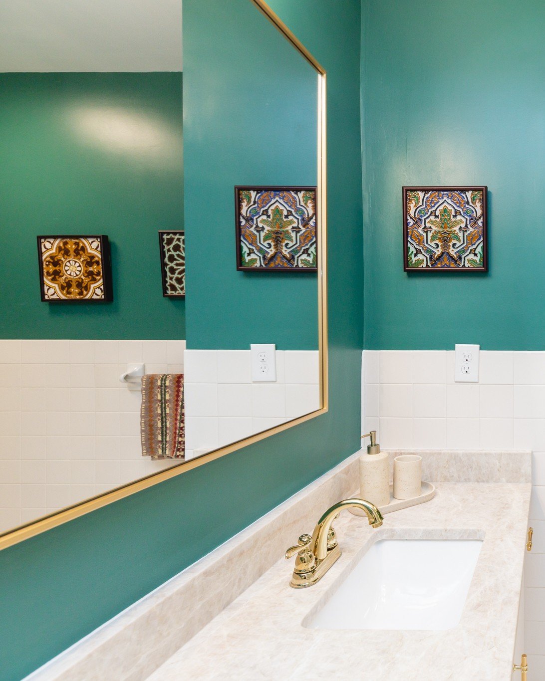
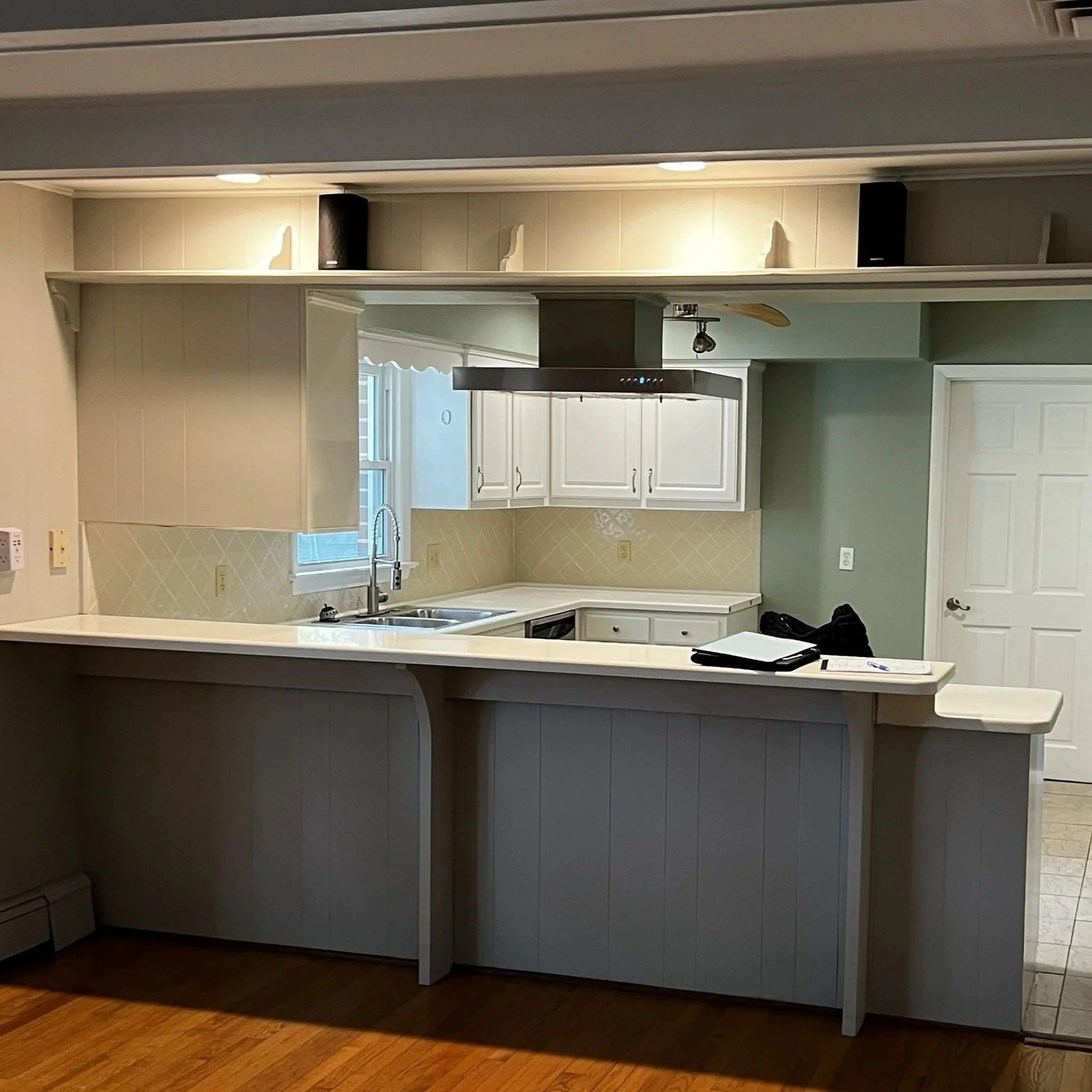
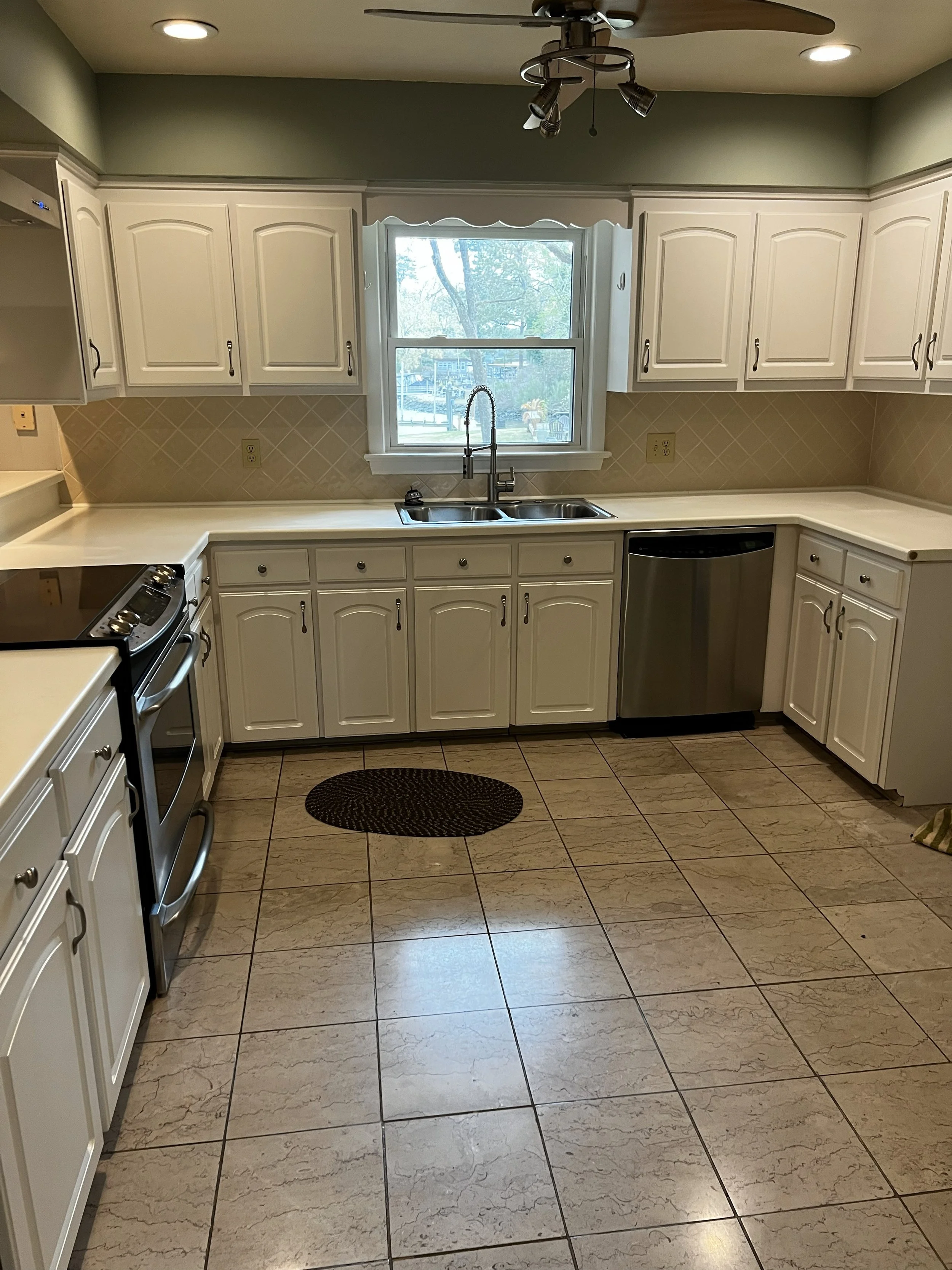
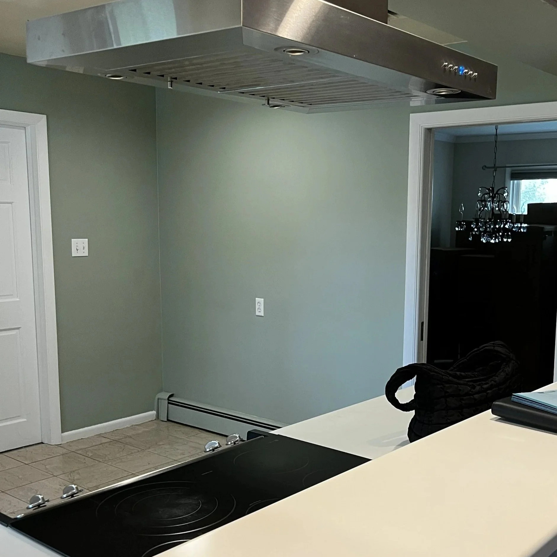
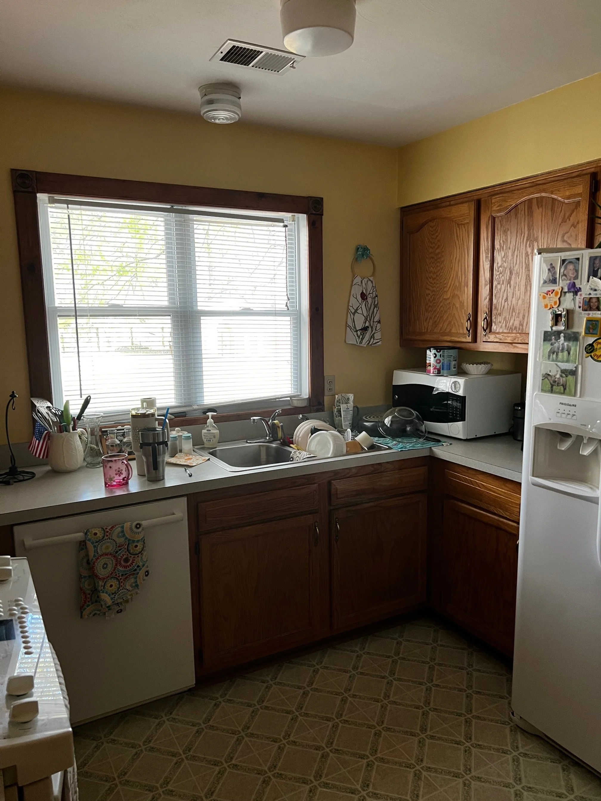
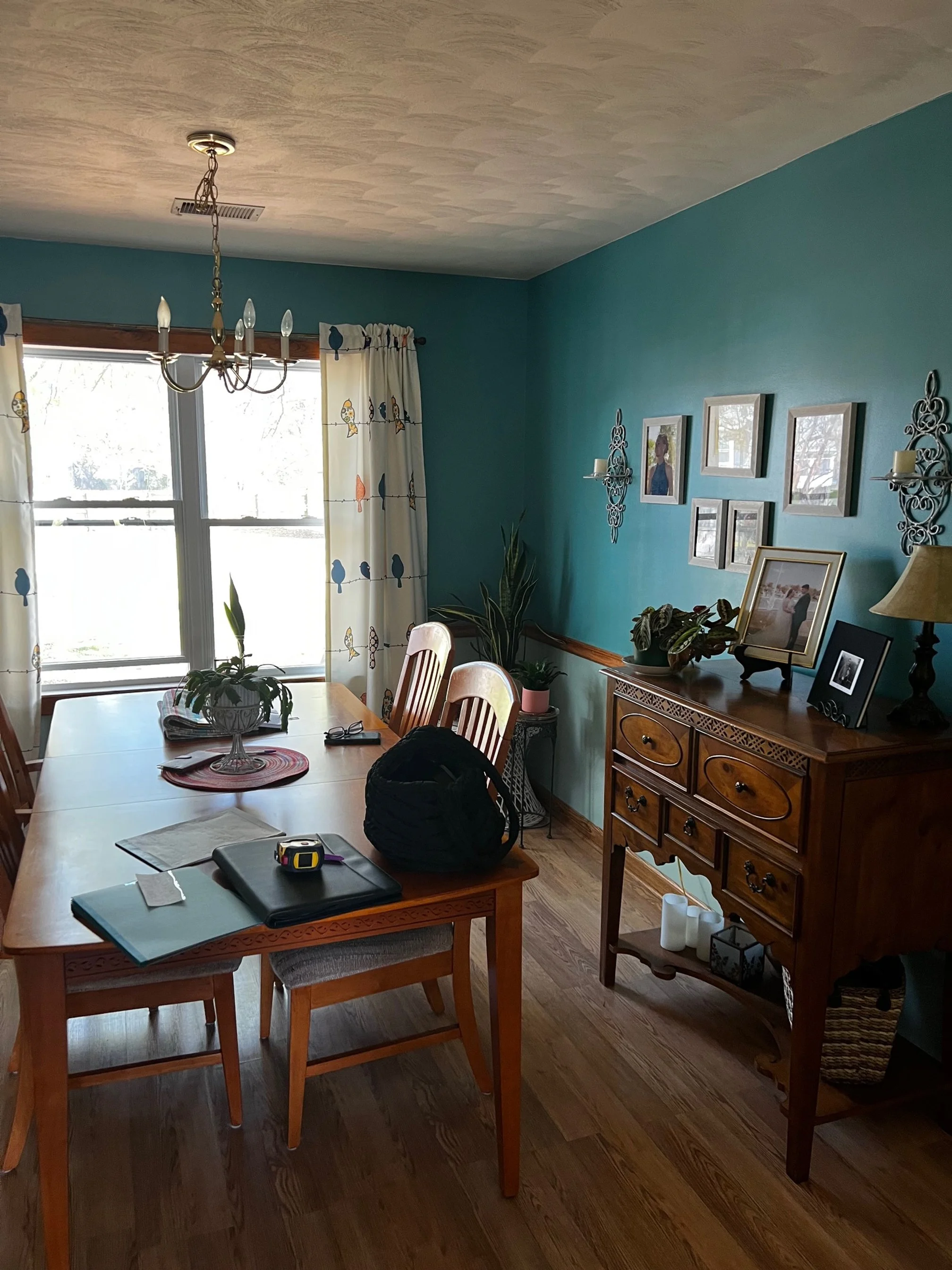
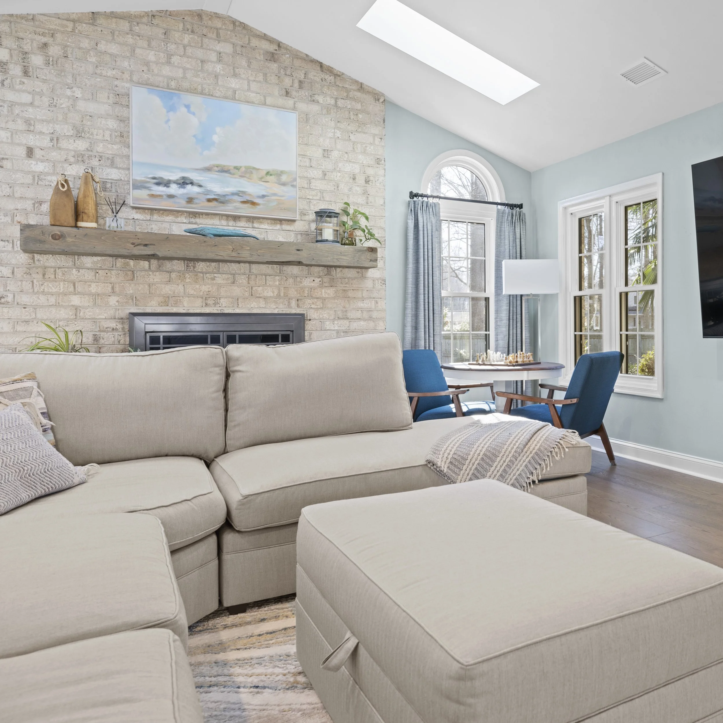
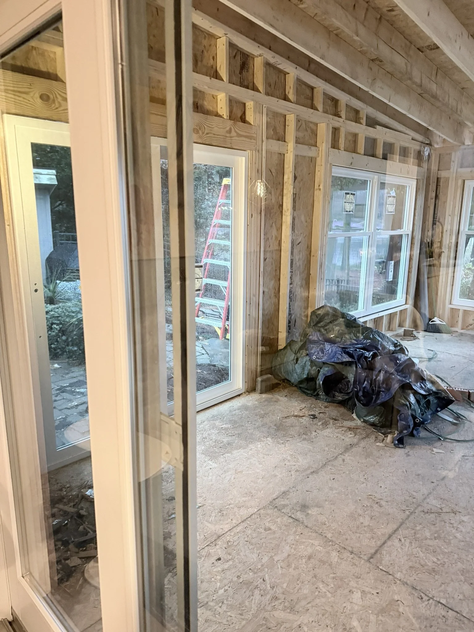
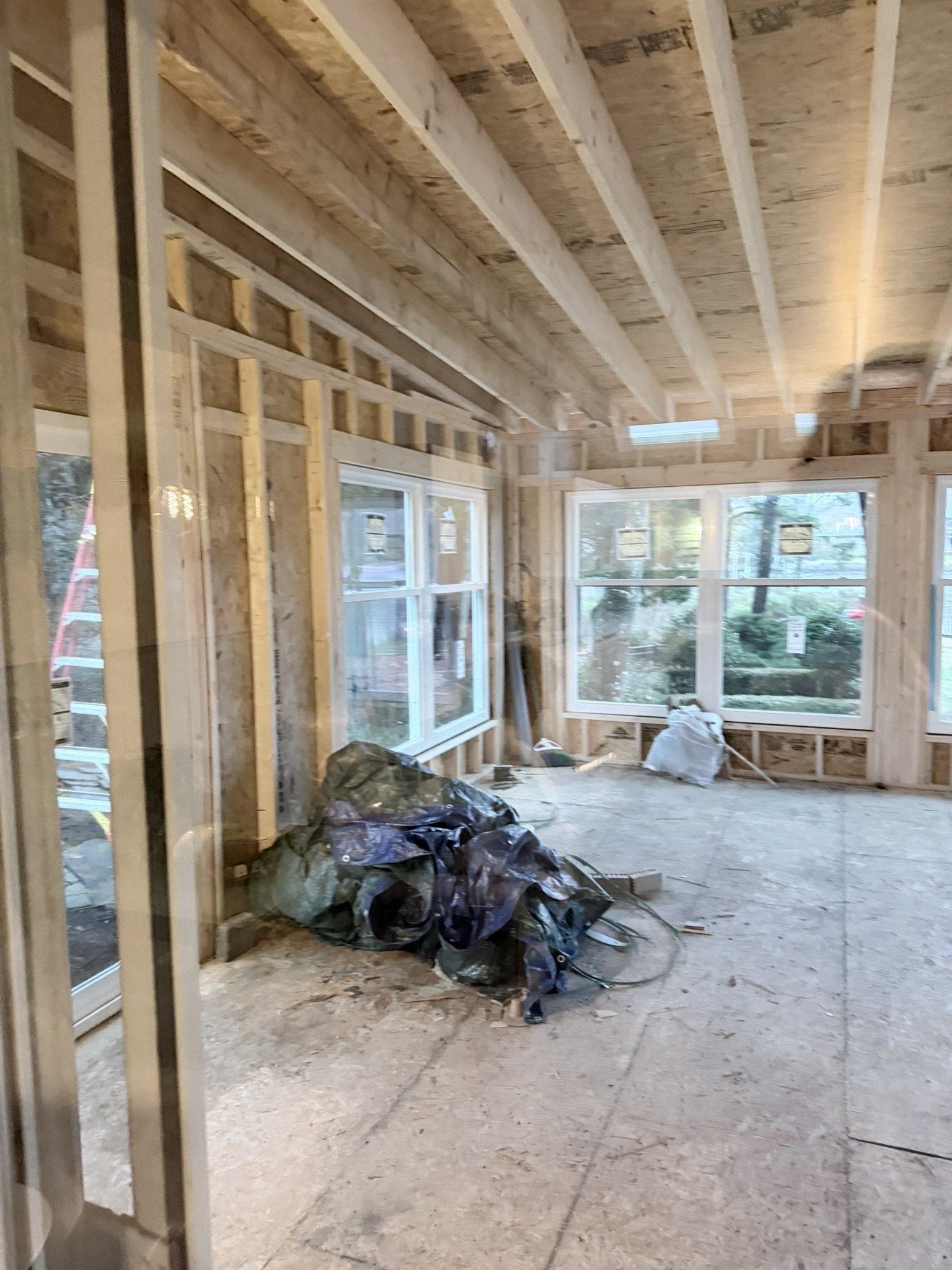
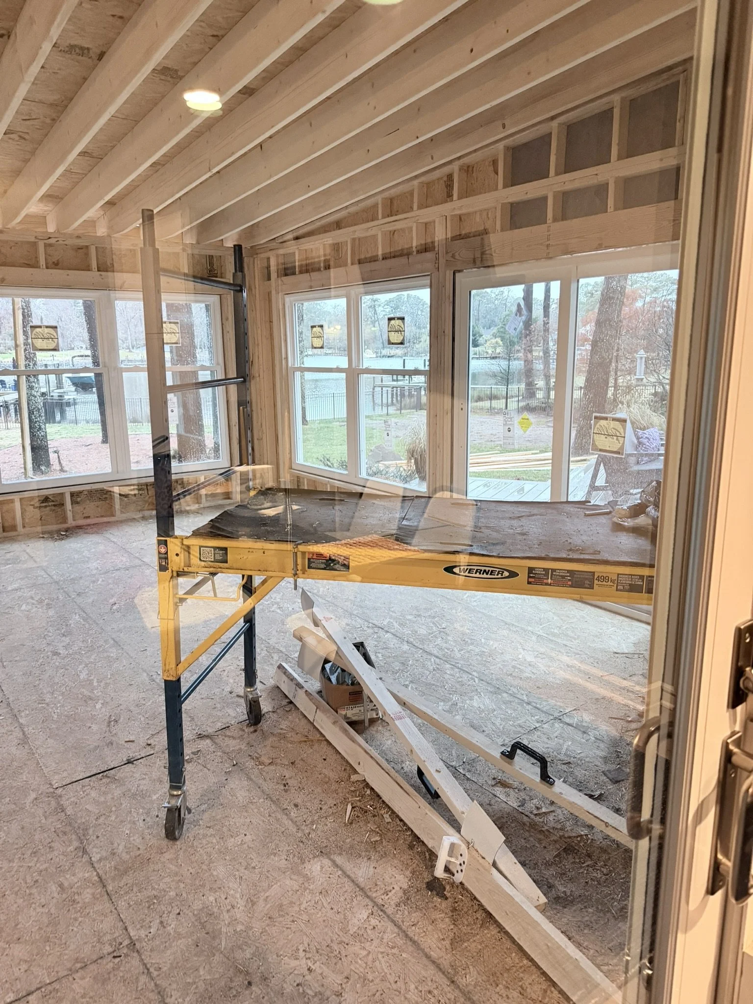
When I began working with these clients, the shell of the sunroom addition was in place, but the finishes and furnishings from floor to ceiling needed to be determined. These clients had an established color palette in other areas of the home, which provided a jumping off point for the sunroom design. I did put a little spin on that, though, developing two distinct design concepts, each featuring a unique space plan, layout, and material palette for the clients to consider.
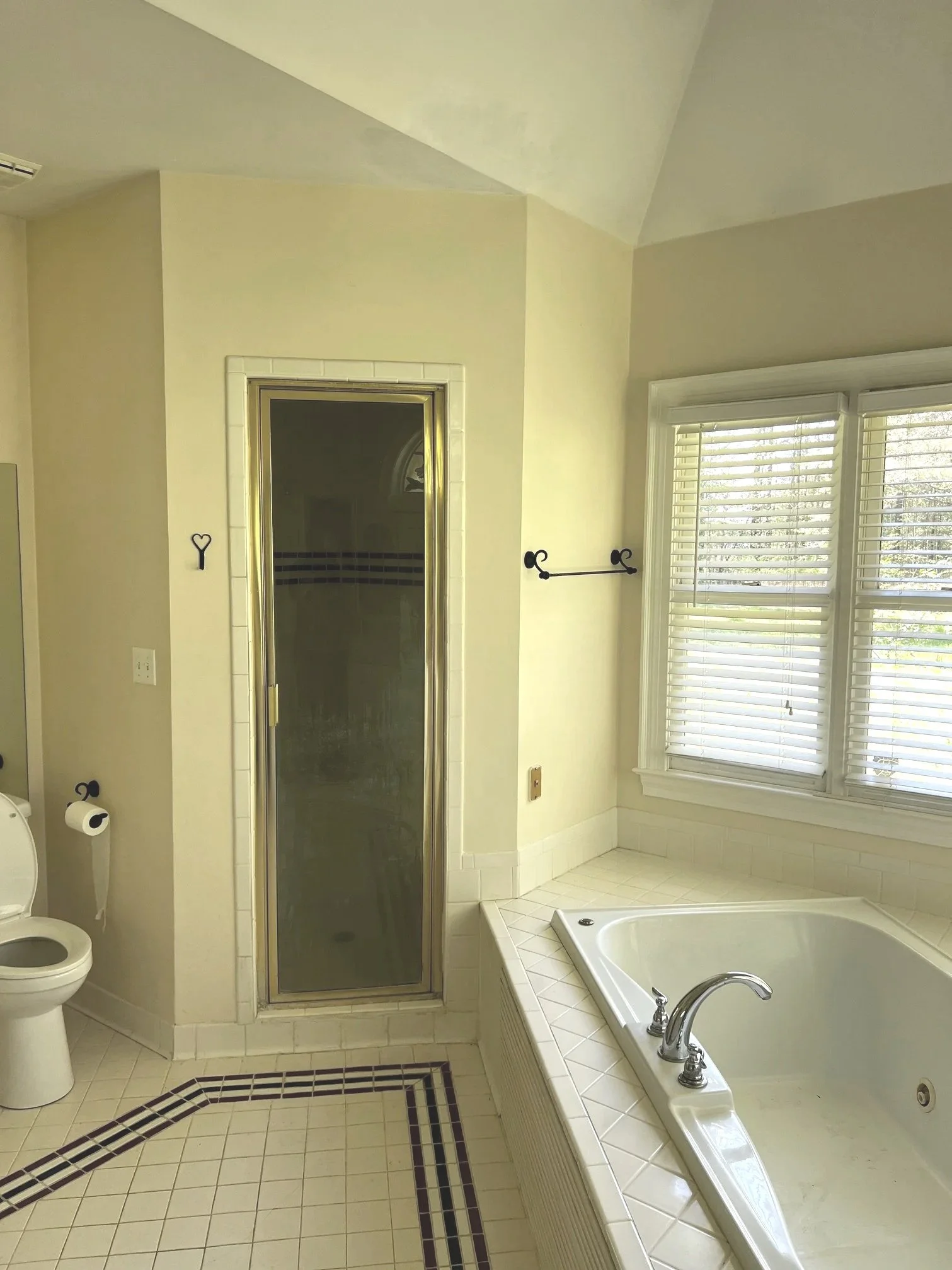
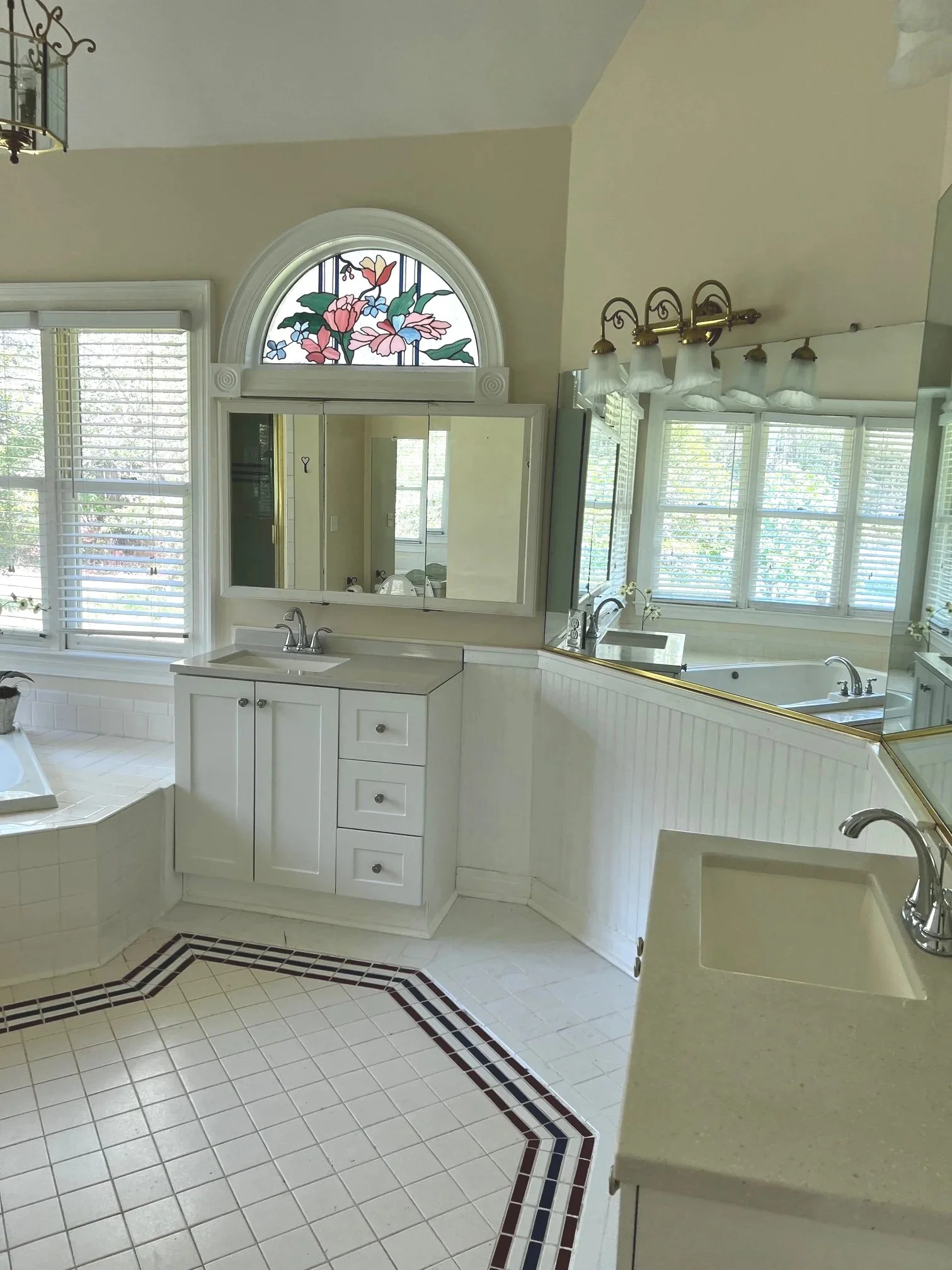
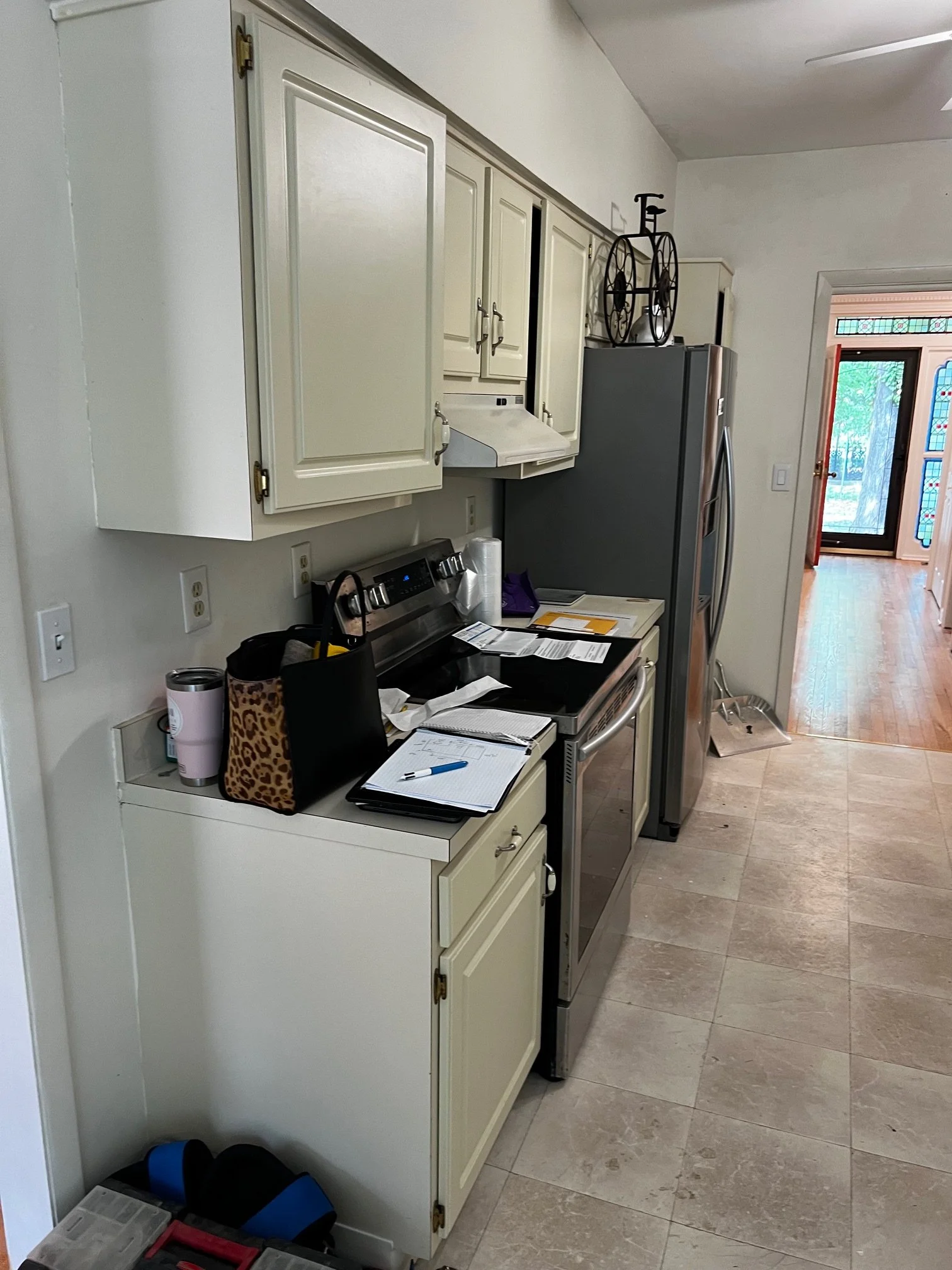
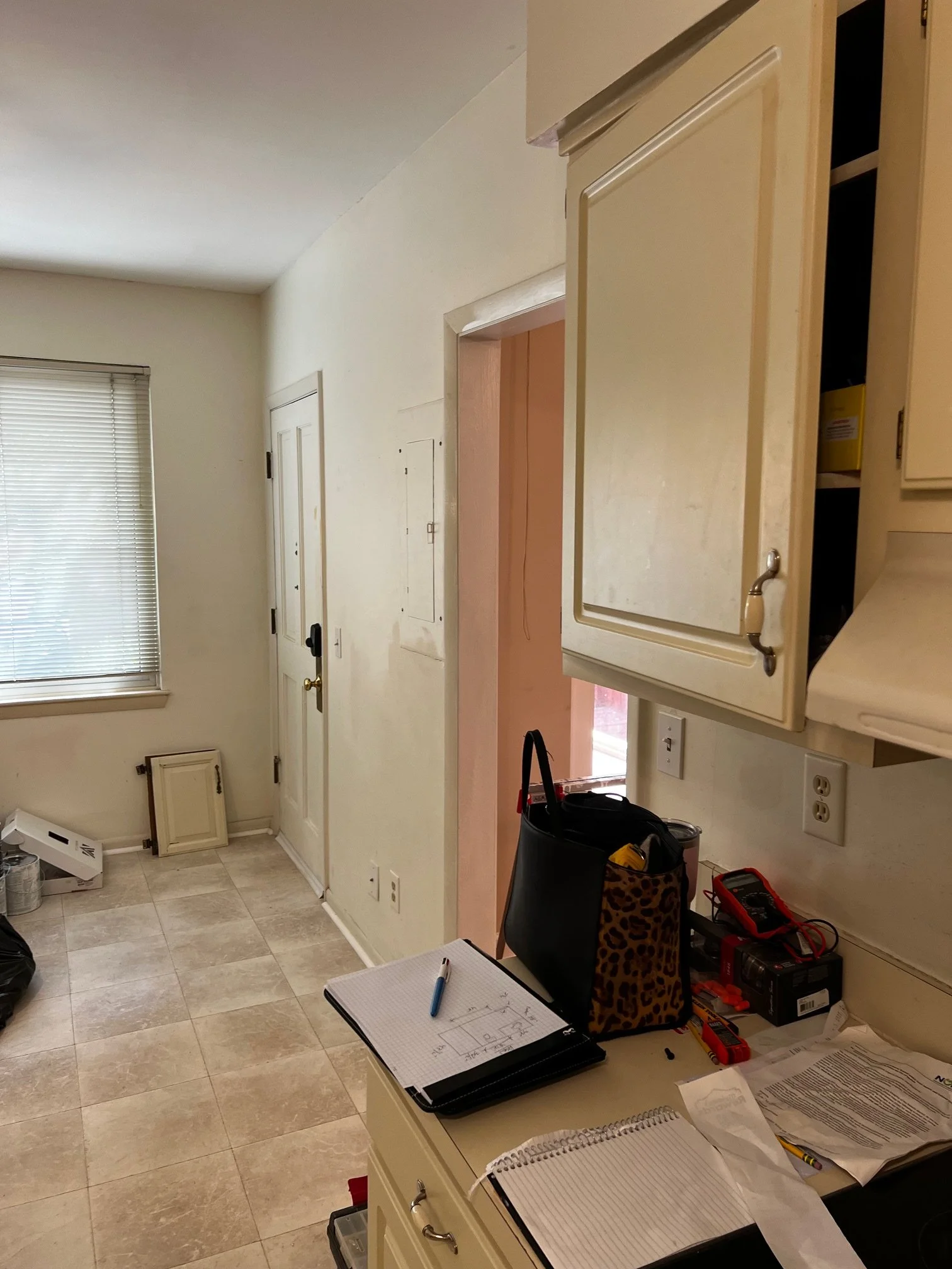
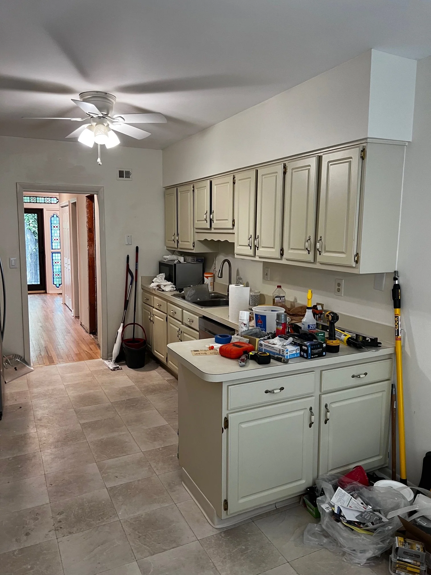
BEFORE
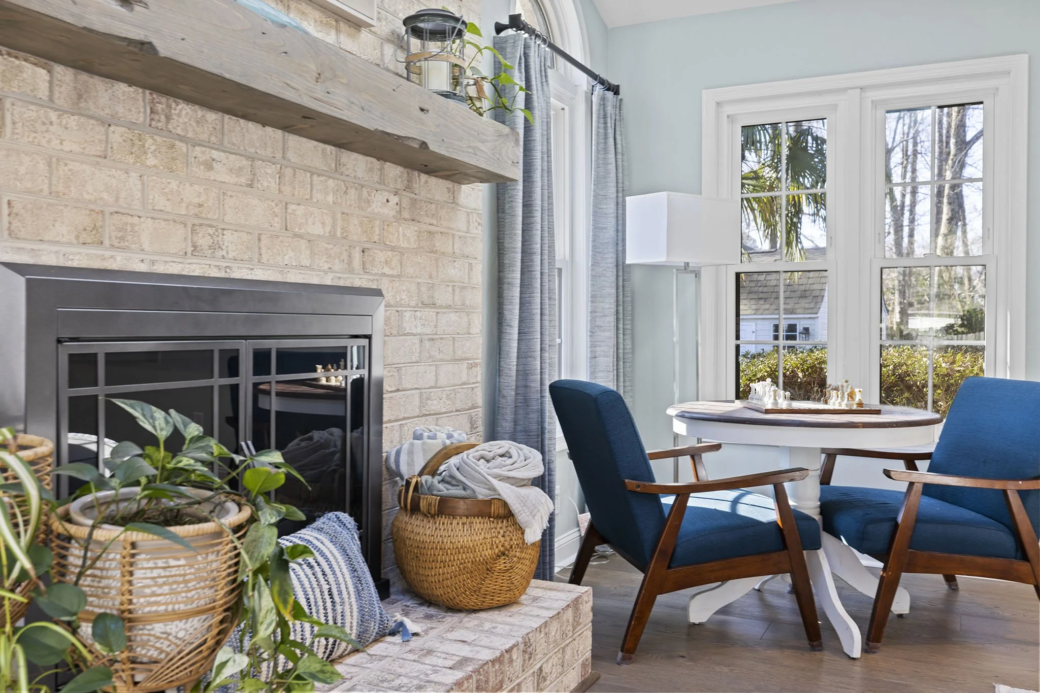
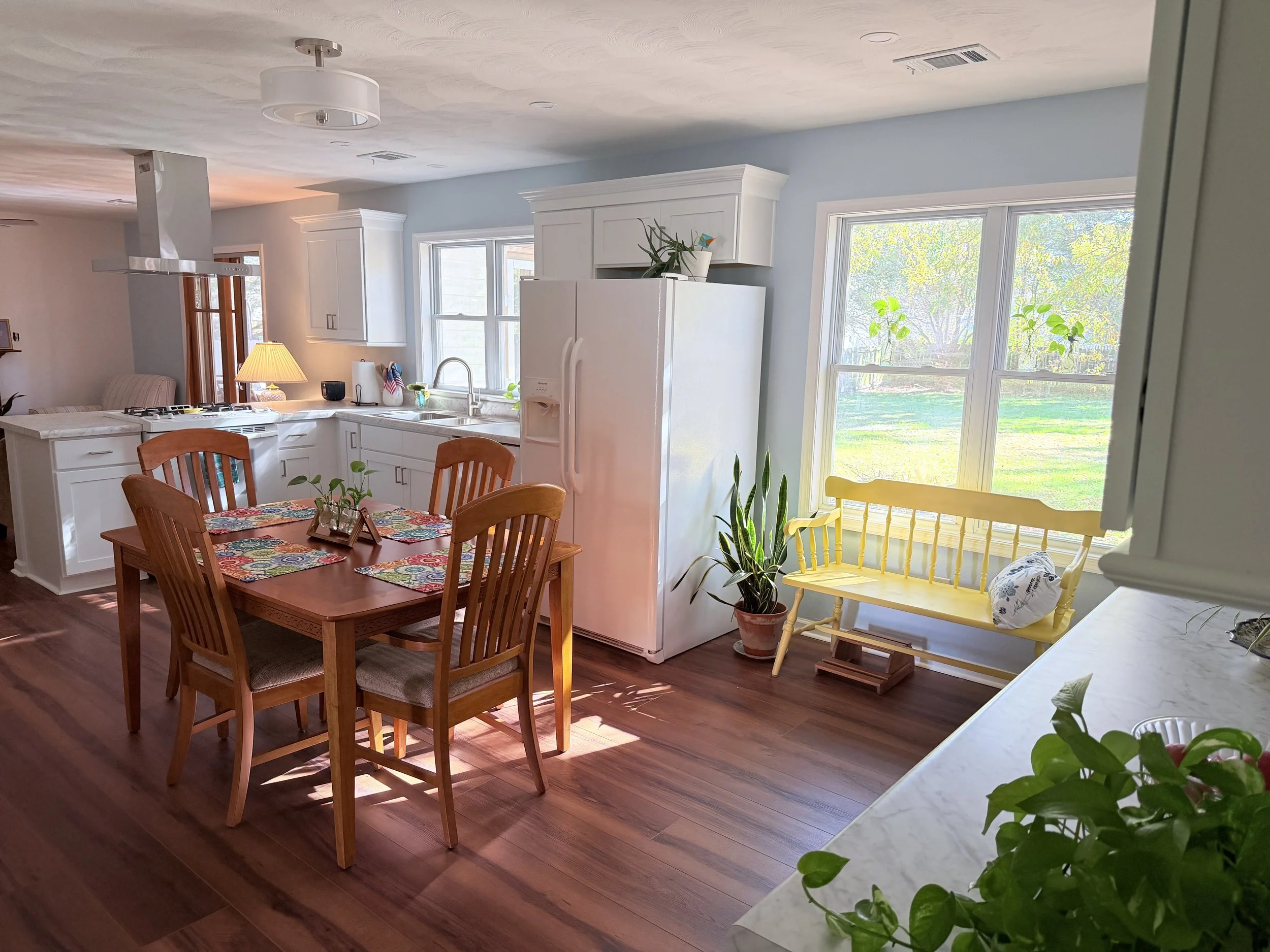
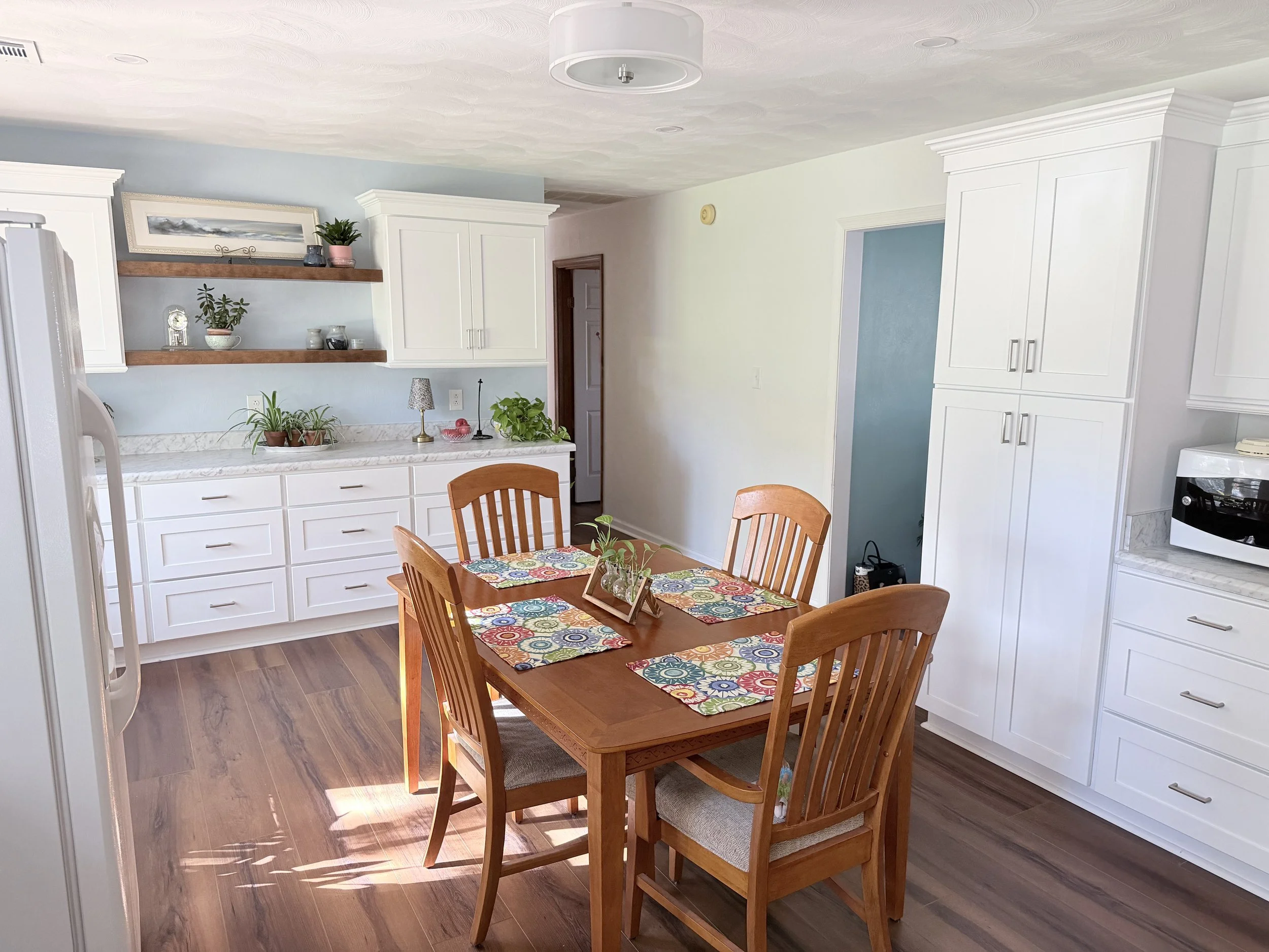
The final selections and layout were determined, resulting in a space to lounge, gather for a movie, or play cards. The finished design feels cohesive with the rest of the home while maintaining a distinct personality all its own.
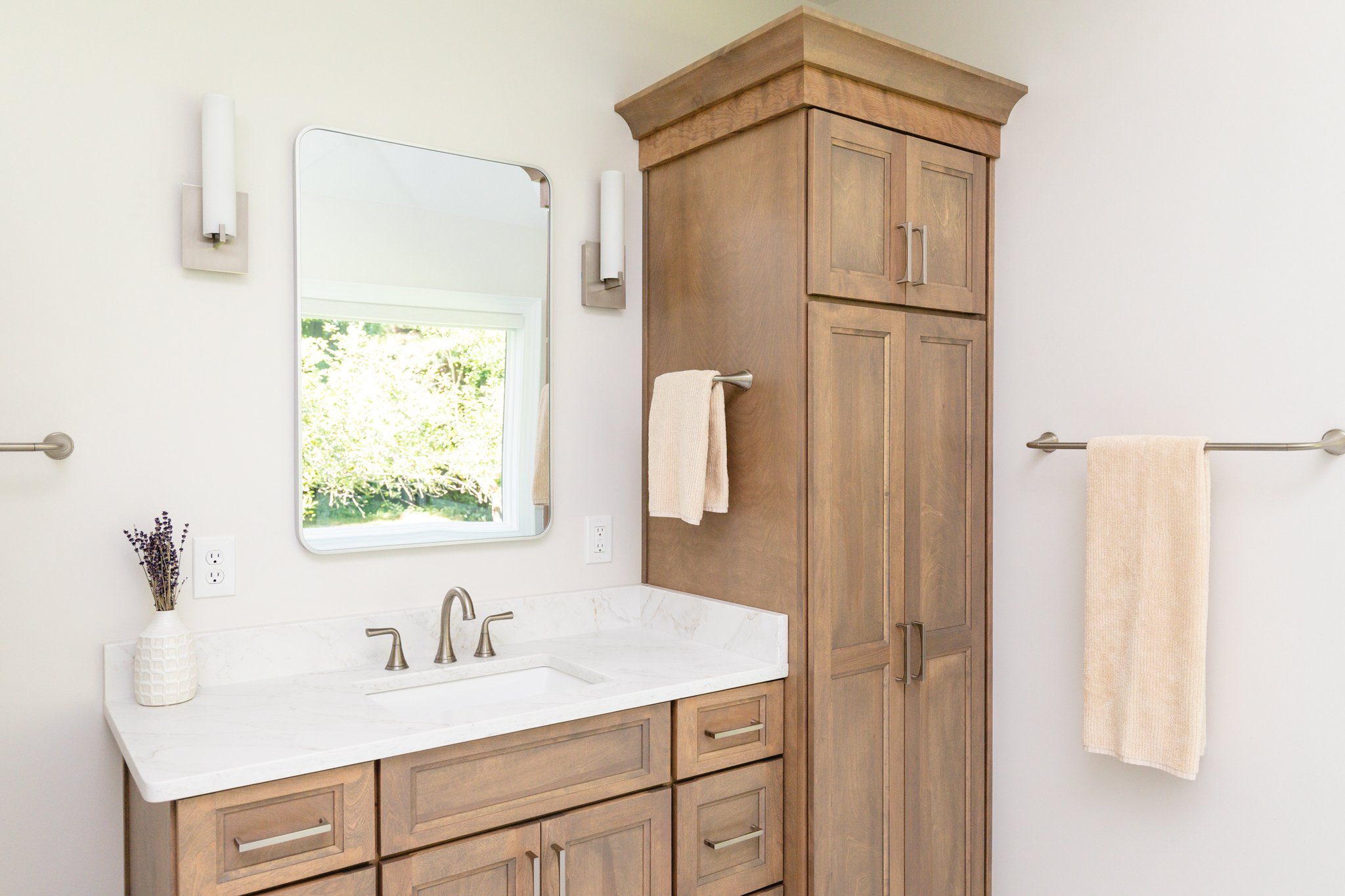
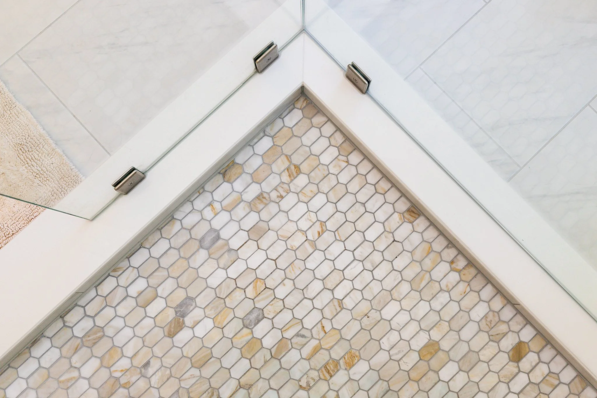
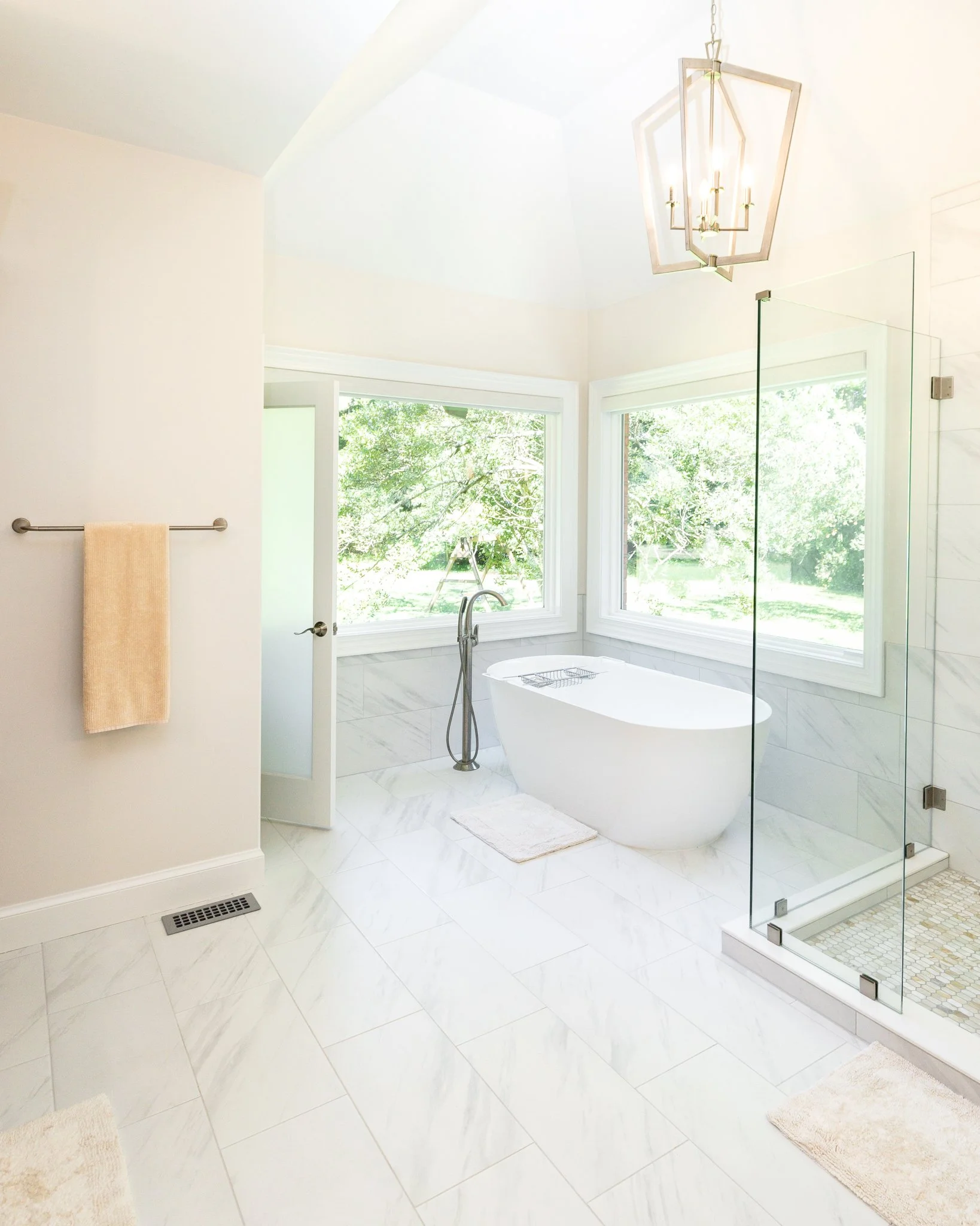
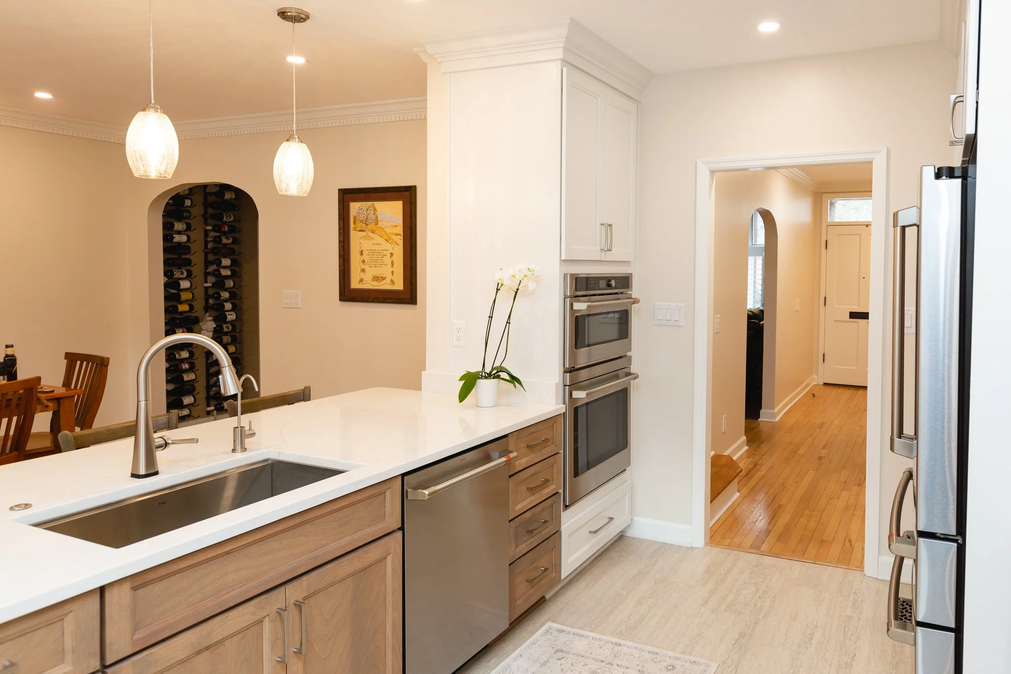
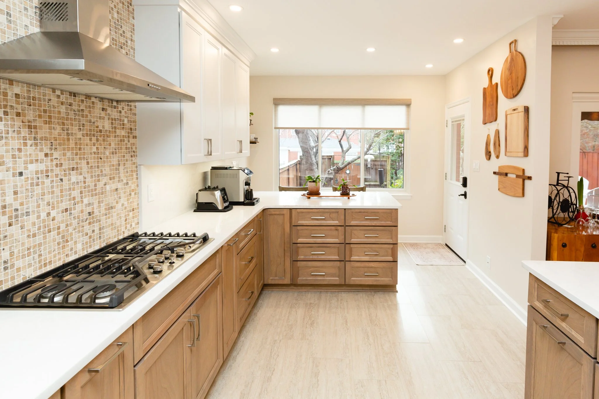
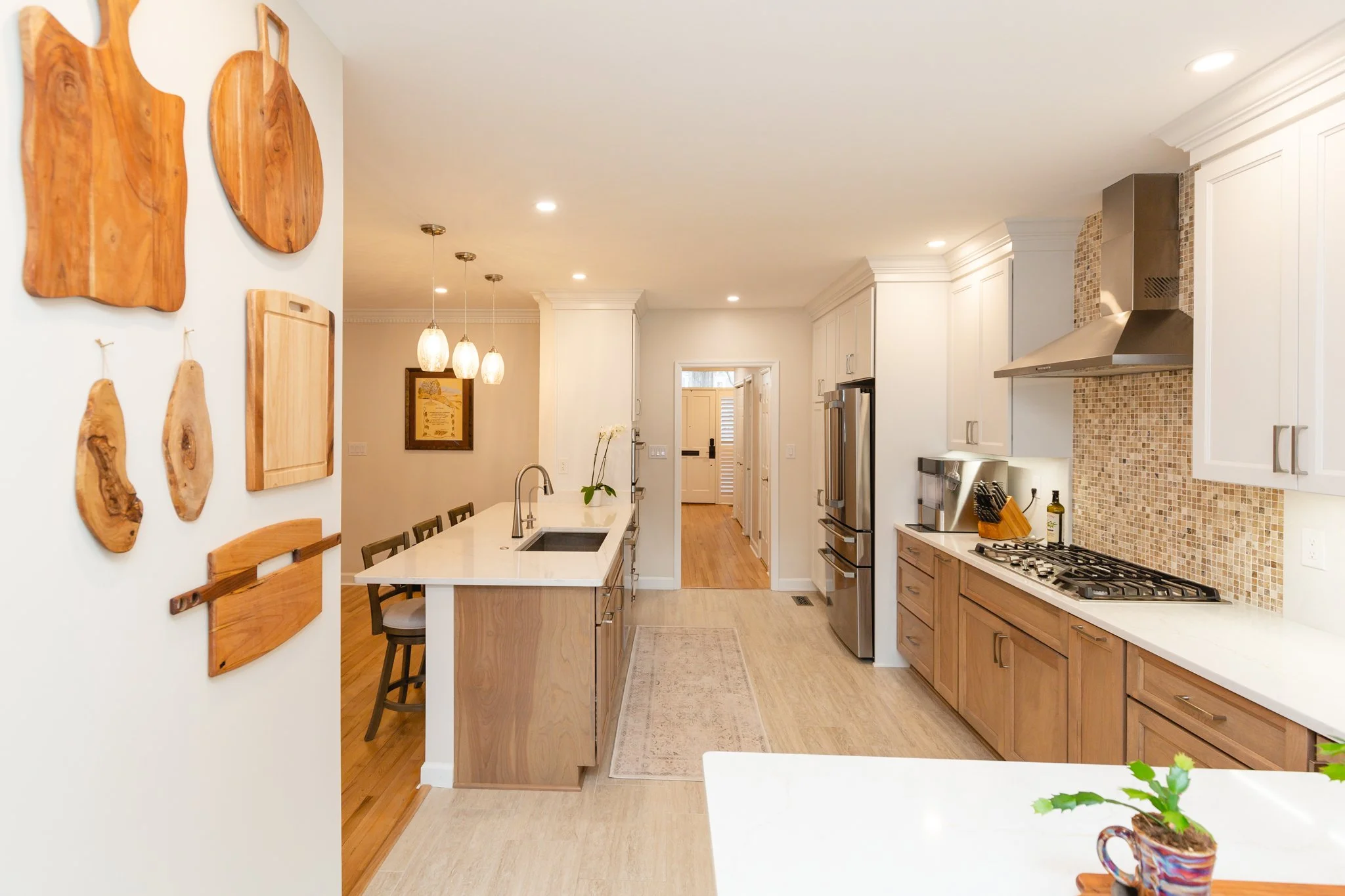
AFTER
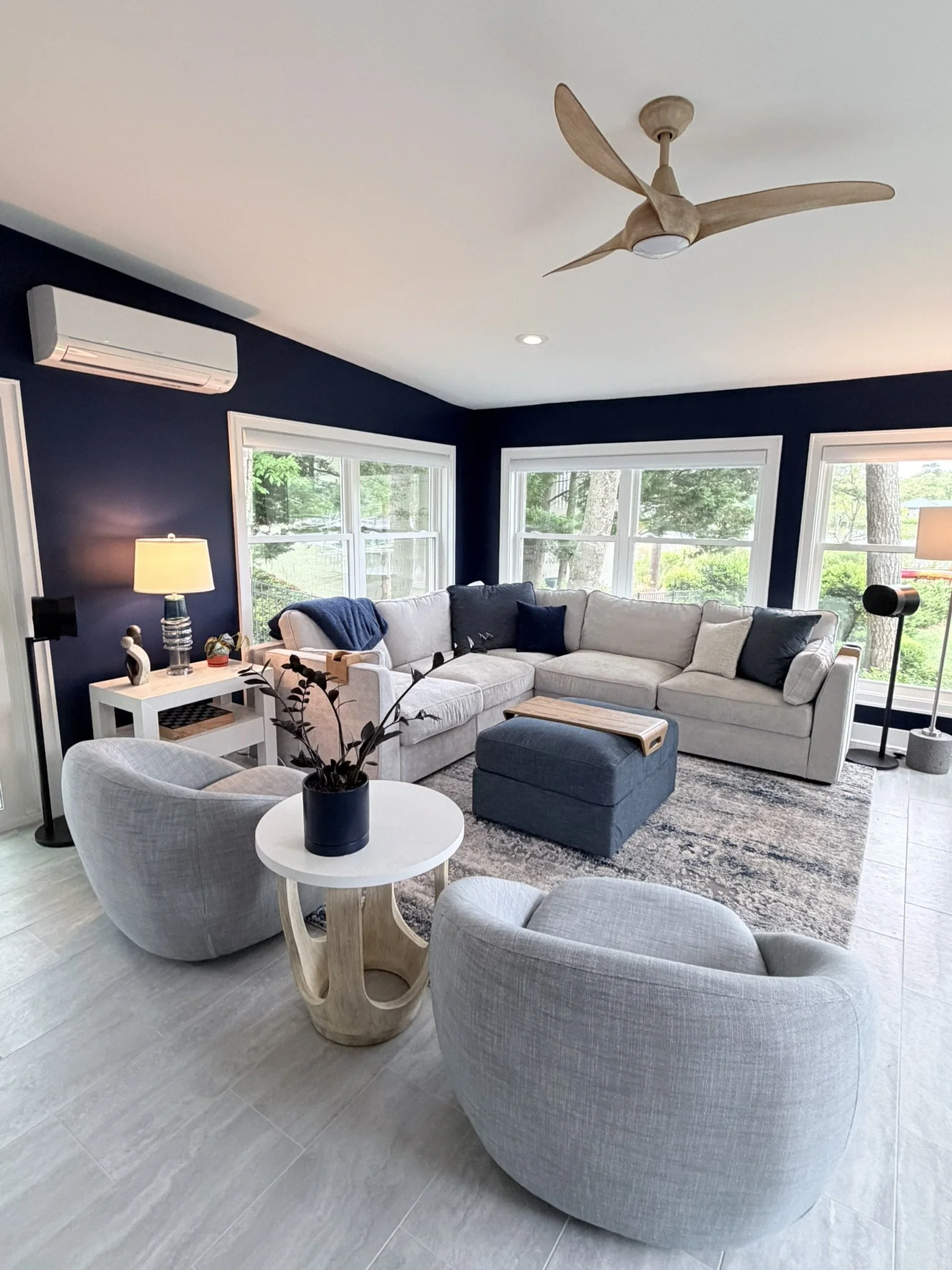
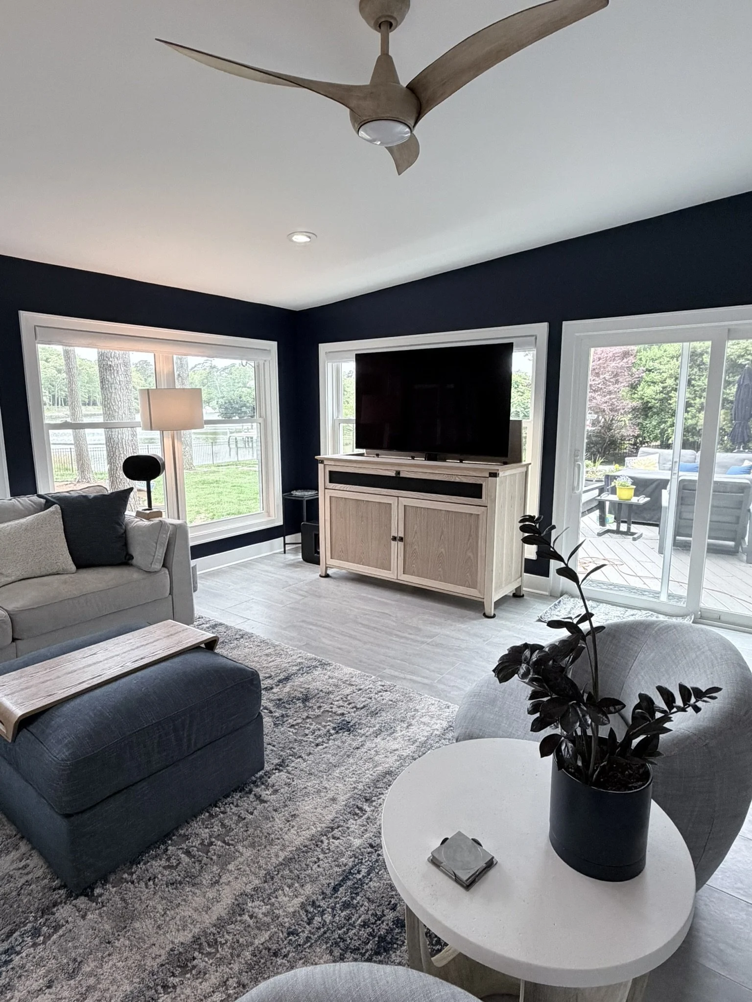
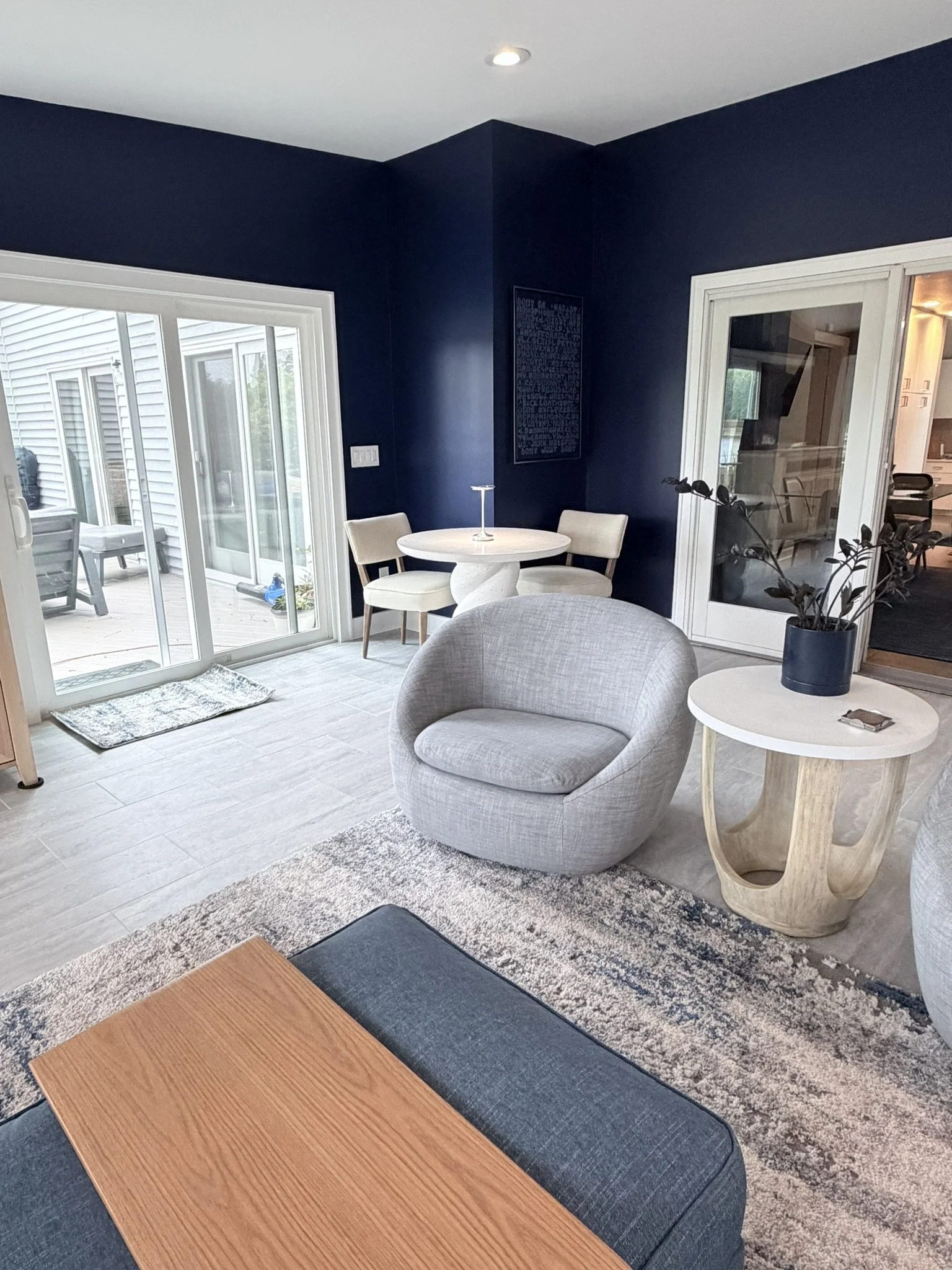
Durable porcelain covers the floor, to provide a long-lasting surface for people and pets, a roomy sectional brings comfort galore, swivel chairs provide cozy and versatile seating, and the TV lift console allows for movie nights when open, and a view of the deck when tucked away. This is certainly a place to kick up your feet and stay a while.
Cheers!
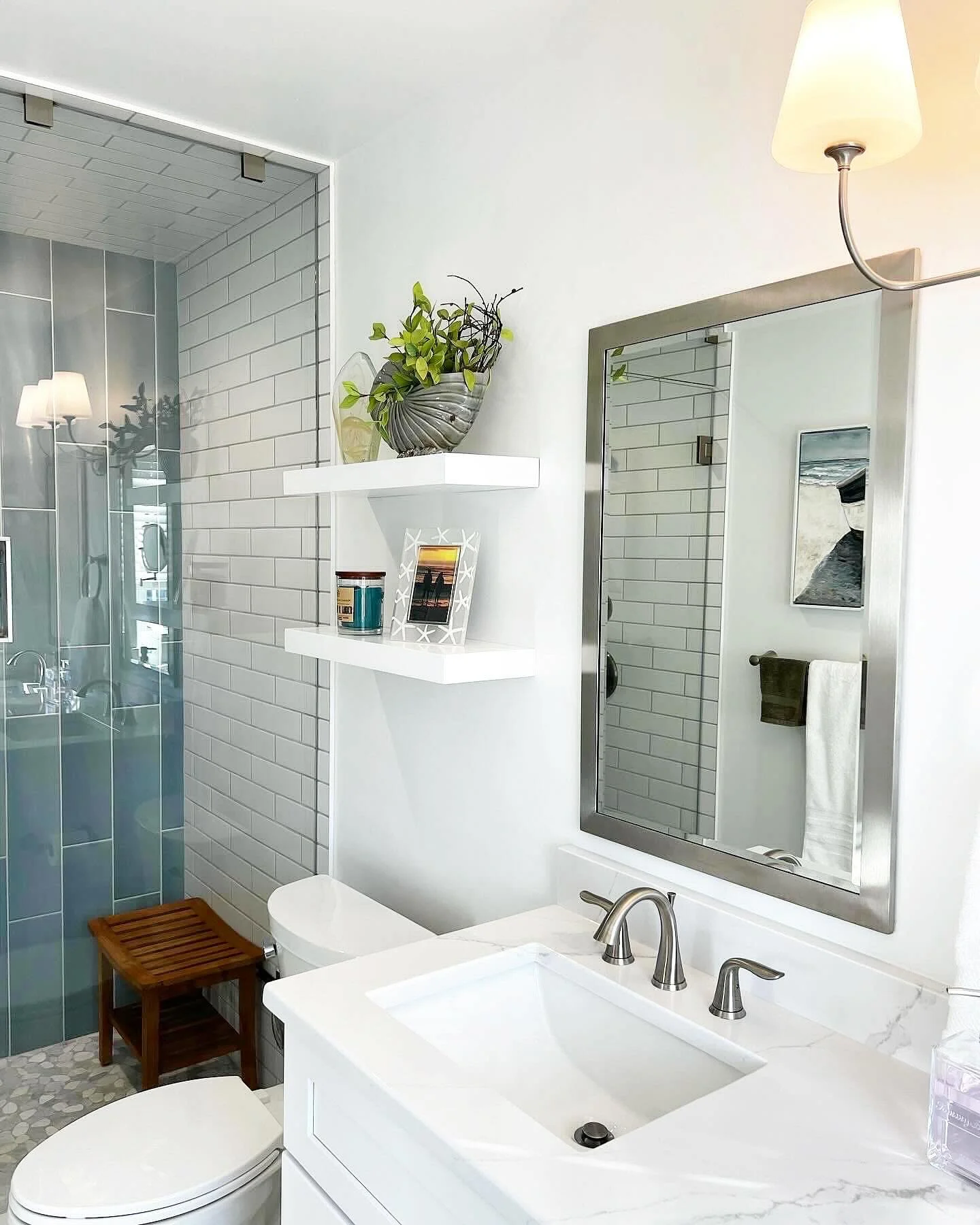
Design and Photos: Jaime Simpson of Creative + Curated