“Art washes away from the soul the dust of everyday life.” - Pablo Picasso
Visual arts evoke emotions in all of us. Some genres of art speak to us more than others; I love it all, but I am partial to abstract paintings, mixed media collages, glass works, and photography. A good friend of mine prefers sculpture, another loves charcoal and pastels, and another favors surrealism.
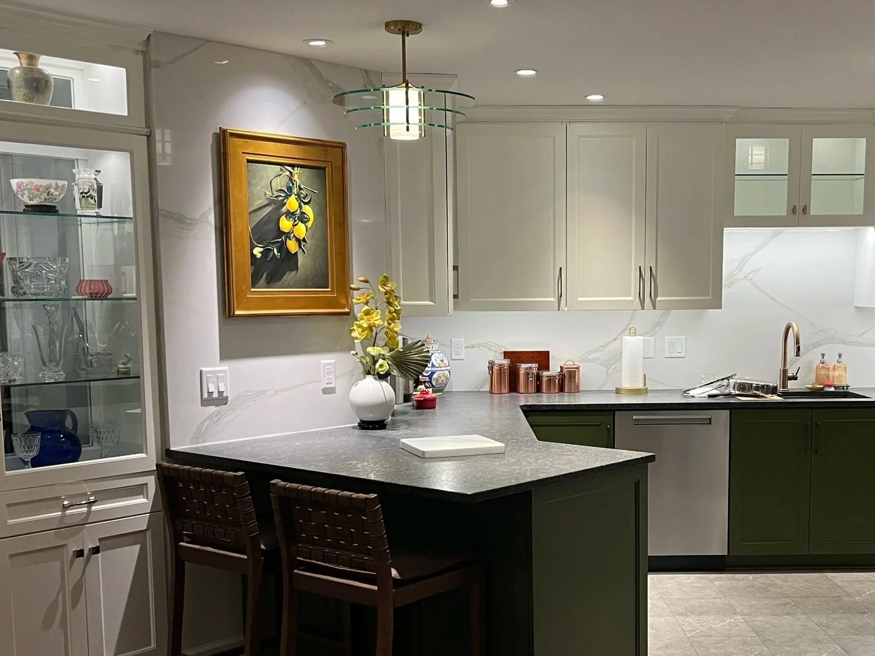
Incorporating art of any kind into our homes establishes a deep connection between ourselves and our spaces that is unique and impactful. Not only does the art give texture and color, it adds depth to the way the space feels when we are in it - how we feel.
Project photo by Lianna Pevar Photography
STYLE + SOURCING:
When adding art to an existing area, I always consider the energy and personality of the space. Bright, peaceful, and airy? I look for softer, lofty color tones with gentle lines. Bold, energized, and lively? I source pieces with strong contrast, saturation, and movement. Earthy and natural? I find elements with texture and tone variation.
I try to source pieces from local and regional artists whenever I can; art shows and openings are great introductions to artists and their styles. I also have trade suppliers that I can turn to for specific styles and types. When traveling, I love to find art galleries that showcase art from the area. Antique galleries, thrift stores, and consignment shops are also great sources for unique and unexpected pieces. Museums, galleries, and individual artists also often have art prints available in various sizes.
Before sourcing new pieces, though, I encourage reviewing existing collections of framed art and accessories. Sometimes relocating existing pieces can completely enliven the spaces and inject a whole new energy.
SCALE + PLACEMENT:
Project photo by Lianna Pevar Photography
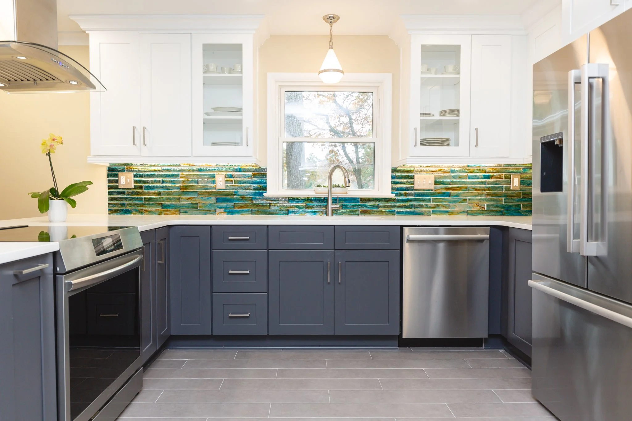
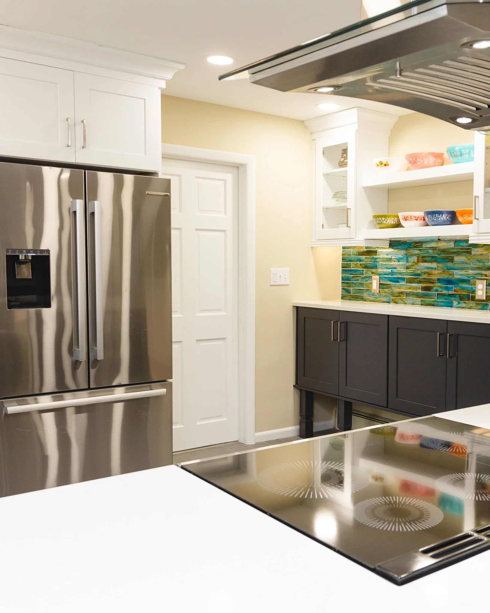
Each space is different and should be treated individually. It is always important to consider the scale of the art location when determining the pieces that will go there. On a wide, deep display shelf, it is best to include 3-dimensional pieces that are larger, with varying heights, to better fill the area and not have the pieces feeling lost in the negative space.
For small wall areas, I recommend leaving several inches (4” at minimum) between an art piece and adjacent door / window trim, corner, or other opening so it doesn’t feel squeezed in. For expansive wall spaces, large individual pieces or multiple smaller pieces in a grouping (diptychs, triptychs, or “gallery walls”) work well to give visual weight to the art and balance the wall surface area.
When hanging wall pieces or groupings, it is best to have the center of the element(s) be at a general eye-level (around 58-60” above the floor).
A LITTLE MORE ABOUT GROUPINGS:
Project photo courtesy of clients.
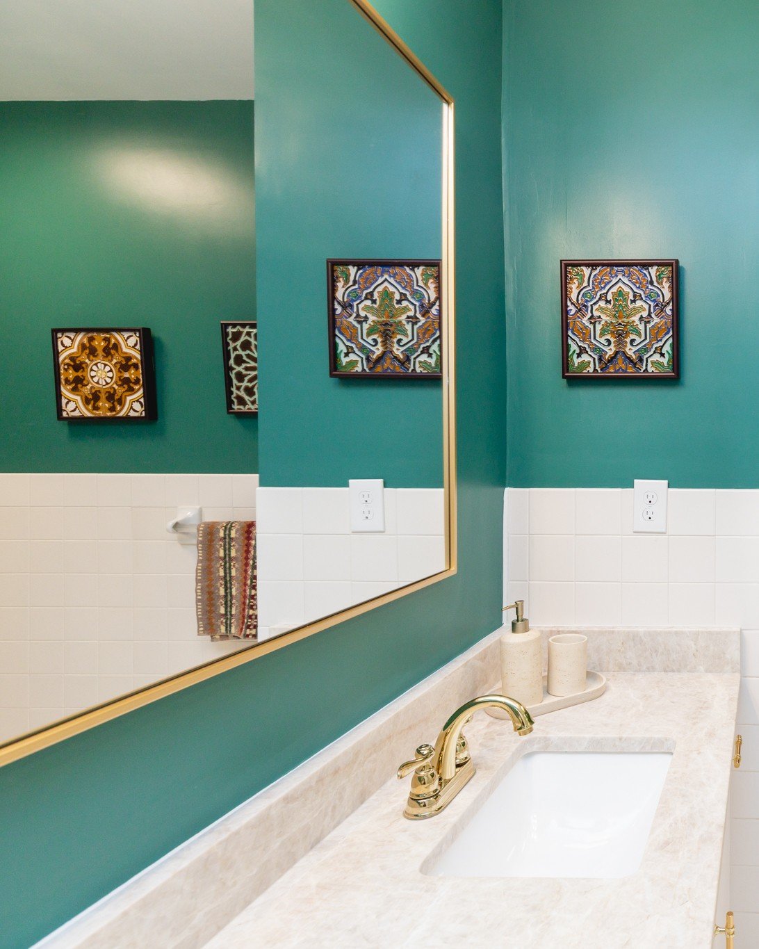
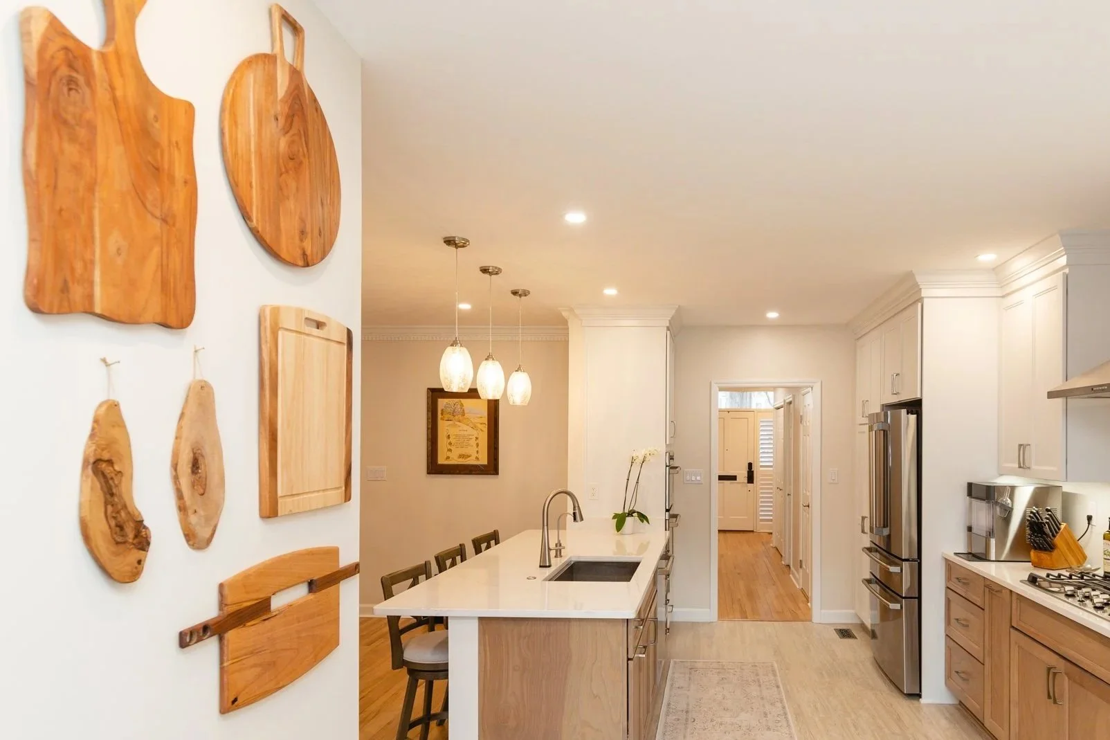
Whether framed pieces on the wall or sculptural items on a shelf or table, groupings can be approached multiple ways. I recommend finding either connection or contrast amongst the items: for connection, that could be a common color, shape, or theme; for contrast, it could be diametrically different styles, straight lines vs. curves, or complementary colors (opposite on the color wheel).
MAKE YOUR OWN ART:
Creating art is a wonderful and unique experience that is like nothing else. There are many classes and workshops available locally that provide the opportunity to learn various art processes and media. If you have always wanted to try sculpture, or photography, or watercolors, or [insert your choice here], I highly encourage you to go for it.
Art is the element that puts the cherry on top; it makes the space a meaningful one. It brings personality, emotion, and depth, creating an atmosphere with harmony and connection.