INSIGHTS: BIOPHILIC DESIGN

bringing the outside in

What is biophilic design? Essentially, it is design that purposefully connects the natural world with the built world. It is design that prioritizes incorporating nature into the design concept.

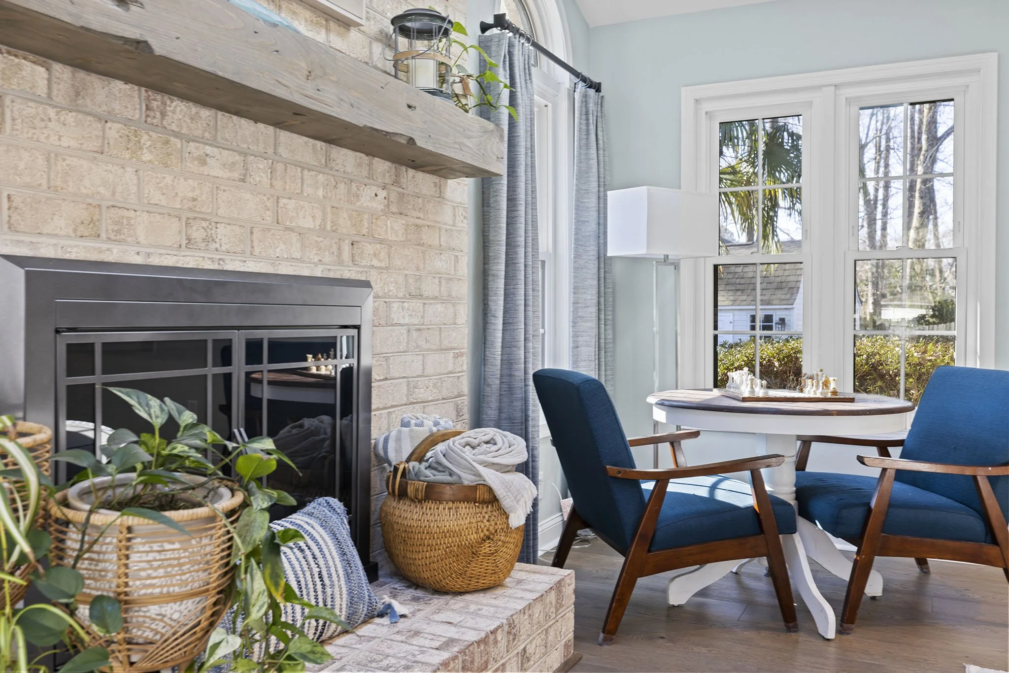
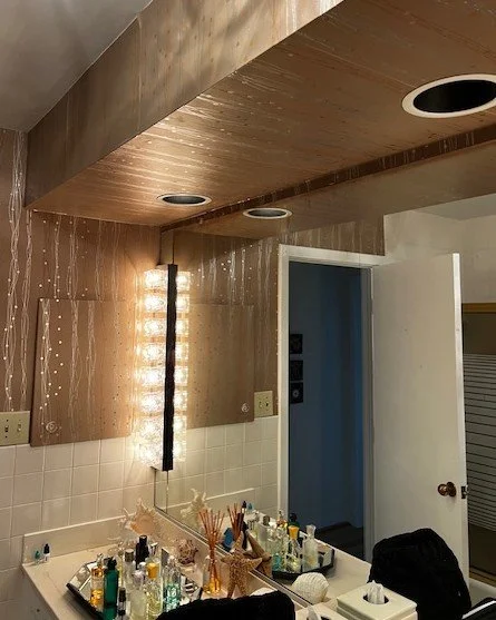
Greenery, woven baskets, natural fabrics, wood elements, and multiple windows to let in light and fresh air.

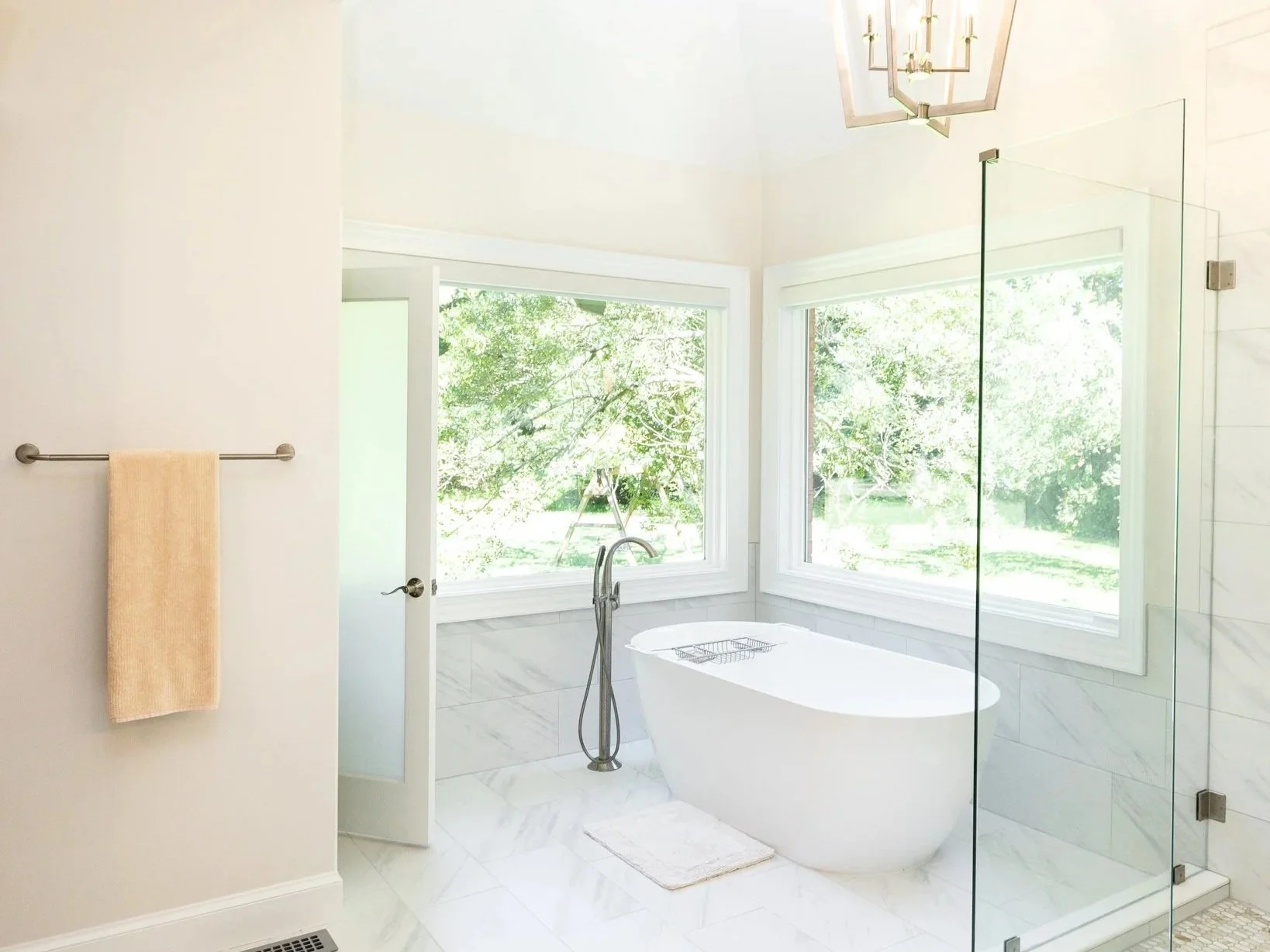
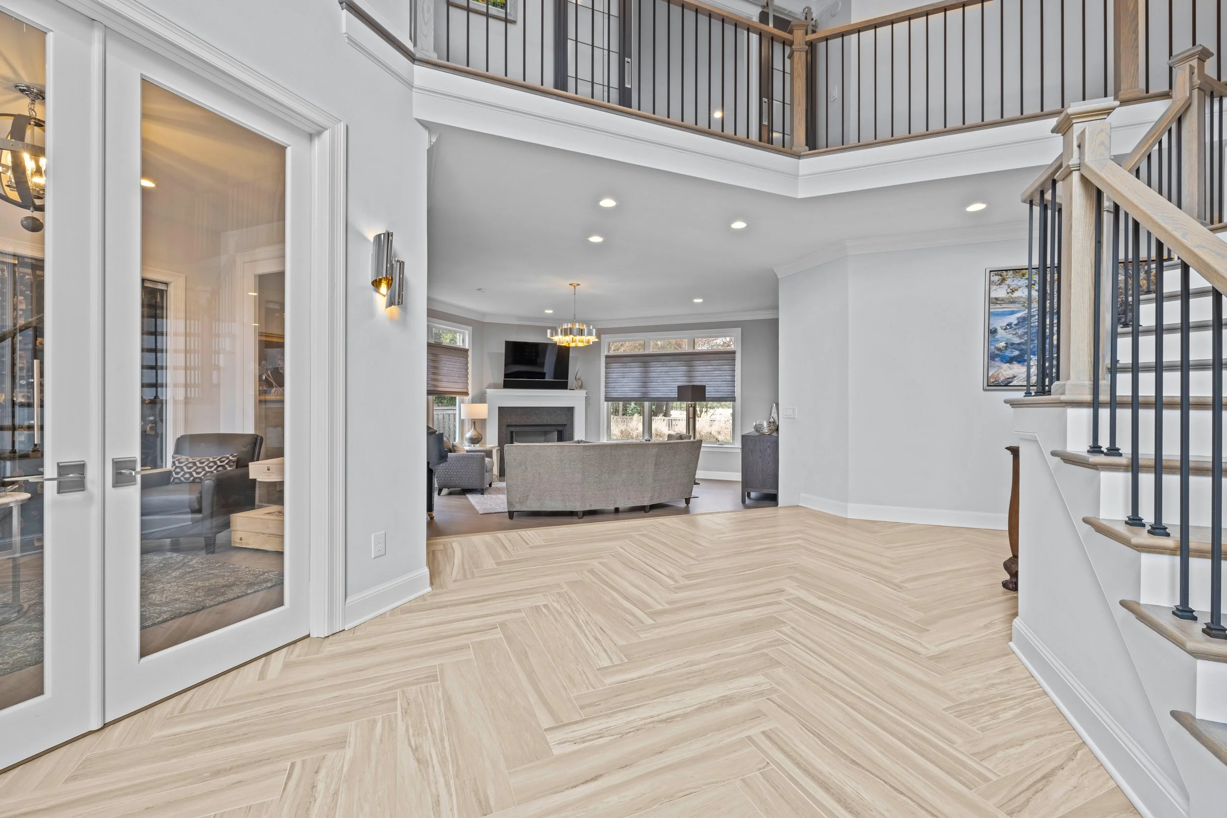
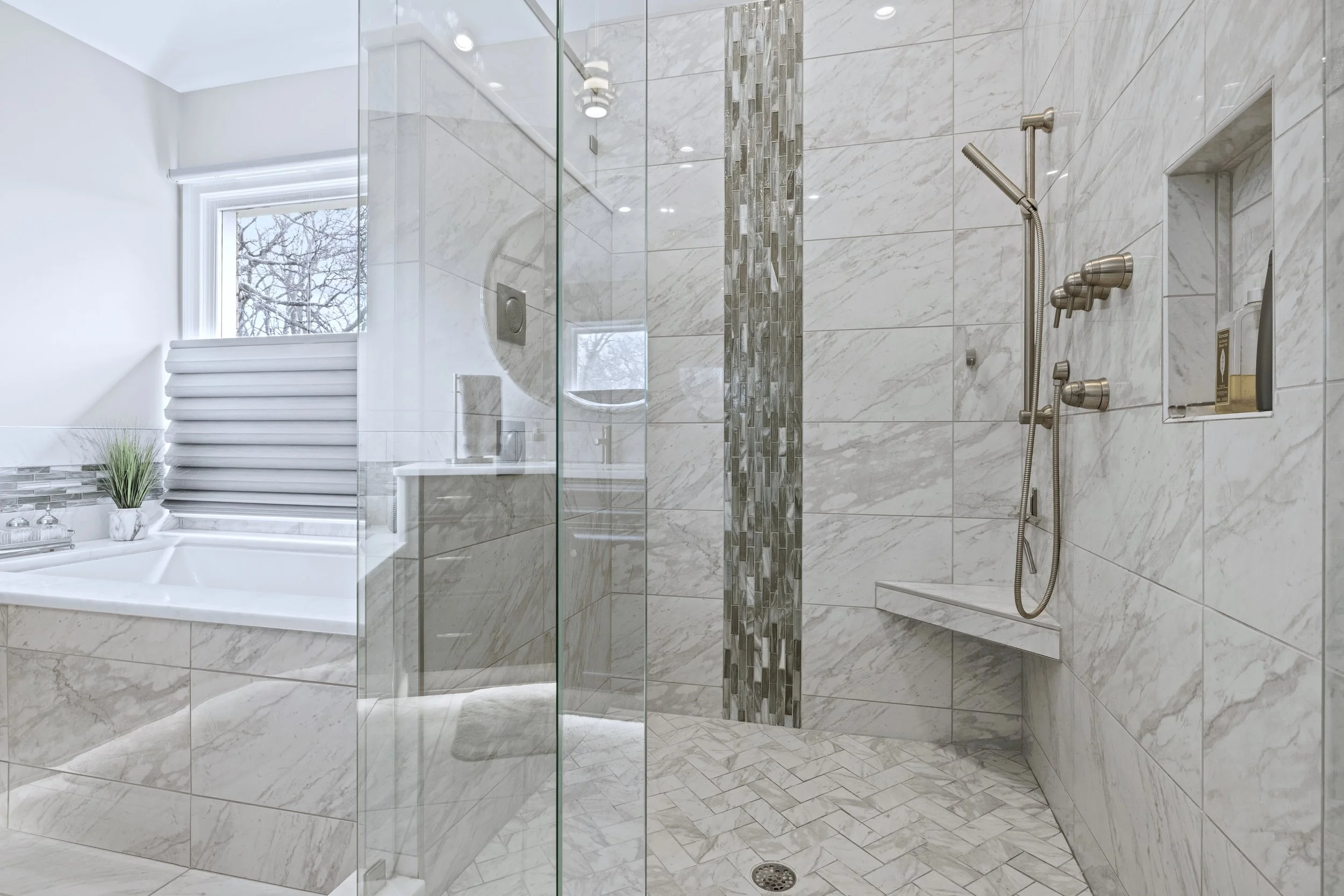
Large windows to increase both the view of the trees and the natural light.

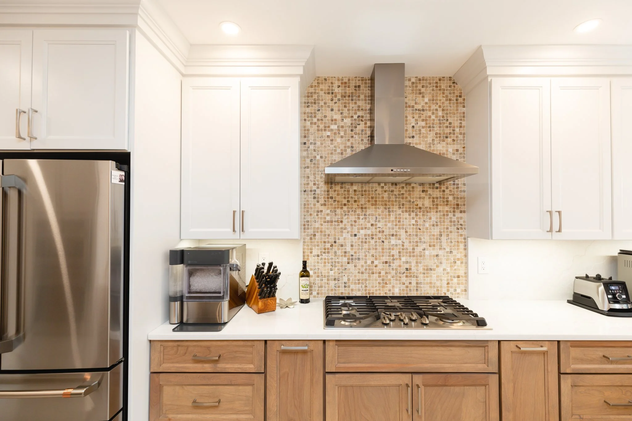
Wood cabinetry with a tumbled travertine stone backsplash feature.

The term biophilic arose in the 1970’s and amplified its presence in interior design in the last few decades, establishing its own genre. I feel that biophilic design is instinctual; we have a visceral connection with nature and inherently wish to be in its presence. As organic and sustainable materials are more readily available, the desire for more natural interiors continues to grow. Below are examples of biophilic elements, the benefits of having a biophilic environment, and ways to be more intentional with boosting nature in our interior spaces.

  • Types of biophilic elements

    • Direct / physical links to nature

      • Large windows for visual connection and access to fresh airflow

      • Greenery and flowers

      • Live-edge wood furnishings

      • Natural materials like jute, rattan, bamboo

      • Stone and pebbles

      • Indoor water features

    • Indirect / representative links to nature

      • Nature imagery and artwork

      • Nature inspired color palettes

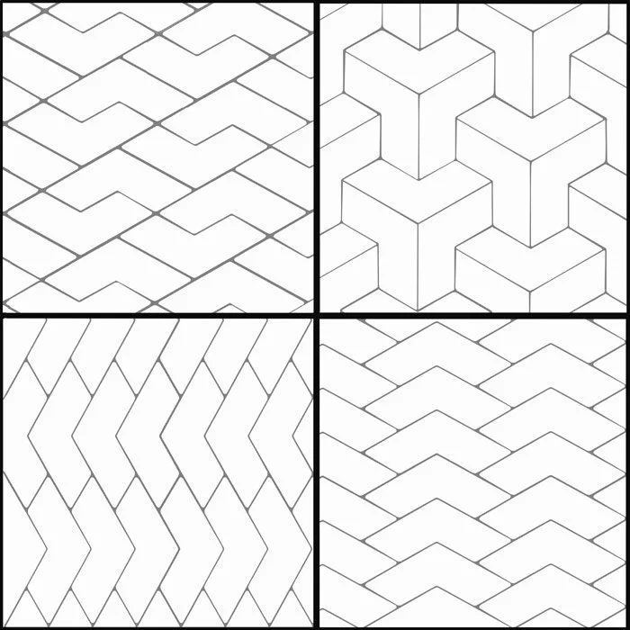
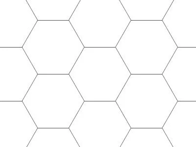
      • Patterns from nature

      • Natural fibers in fabrics, like linen and cotton

      • Circadian lighting (lighting that follows the shift in brightness and color tone of the sun throughout the day)

  • General benefits

    • Reduced stress

    • Improved sleep

    • Better air quality

  • Ways to incorporate and layer these elements in your home

    • Hanging plants, plant stands

      • In households with pets, please refer to the toxic and non-toxic plant list from ASPCA linked here to know which plants are safest

    • Window treatments and bedding with natural fibers

    • Floral patterns on pillows or in artwork

    • Live-edge wood accent tables

    • Lamps with circadian lighting

    • A tabletop or wall mounted water feature

Bringing elements of nature into our homes adds a layer of warmth that is soothing and restorative. Nothing else can compare to the calming and grounding effect that nature has on us. Finding ways to sprinkle more of it into our lives is always a good thing.

HALL BATH REMODEL - NORFOLK

After the primary bath remodel was complete, it was time to work on the hall bath. This project did not require an overhaul, however; the tub and tiles were in great condition, as were the cabinetry and plumbing fixtures. Despite only some of the elements getting an upgrade, the end result is a whole new look.

BEFORE

The wallcovering, soffit, mirror, lighting, and countertops were removed; a gorgeous quartzite countertop, lively wall color, and new lighting were brought in. A new custom (taller) glass enclosure renewed the entire shower, new cabinet hardware refreshed the cabinetry, and the clients’ art tiles were more than perfect for the space.

AFTER

The bathroom is now so vibrant and energized, without having to start all over. Yay, design!

Design: Jaime Simpson of Creative + Curated

After Photos: Lianna Pevar Photography

HALL BATH REMODEL - VIRGINIA BEACH

I had the joy of working with these amazing clients on a second bathroom project in their home. A few years ago, we remodeled their primary bath space, and it was now time to move onto the hall bath. Many of the original elements were still in place, and though they had done their job well, it was time for them to retire.

BEFORE

The tub and tile surround were taken out, and an elegant tub insert was used for easier maintenance. The single sink vanity became a double sink for greater functionality and usability. Porcelain tiles now grace the floors, and a soft wood stain adds warmth. Matte black fixtures bring contrast and a little drama (the good kind!), balanced by a misty blue-green tone for the walls. Additional lighting was incorporated to better illuminate the space, which is always a plus.

AFTER

The results are so fresh and bright - this bathroom definitely has a new lease on life. Yay, design!

Design: Jaime Simpson of Creative + Curated

Contractor: DB Construction

After Photos: Lianna Pevar Photography

INSIGHTS: TILE PATTERNS

MORE TILE TALK

As a follow up to my recent post in which I discuss the various types of tile, this entry is focused on tile patterns. There are many different ways to arrange tile when installing on walls or floors, and the pattern can have a dramatic effect on the visual results.

The options are extensive, so I will be focusing on the patterns most often used for tile installations.

Example photos from past projects. From left to right: brick pattern (horizontal); herringbone; straight stack (horizontal); random stagger.


SET STRAIGHT or Straight stack

Shown horizontally.

This is basically as straightforward as it sounds (no pun intended). This tile pattern is the simplest, where tiles are placed end to end, with all edges lined up (no overlap or stagger). Rectangular tiles can be set straight vertically or horizontally.


1/2 STAGGER OR BRICK PATTERN

A staggered pattern can be implemented with square or rectangular tiles. The most common of the staggered patterns is the brick pattern or 1/2 stagger. Tiles in a brick pattern are staggered half the overall length of the tile, so that the end of one tile lines up with the center of the tiles above and below it. It is most widely known as a brick pattern because historically bricks are arranged this way.


1/3 STAGGER OR 1/3 OFFSET

Directional 1/3 stagger (to right), in horizontal orientation.

Like the brick pattern, the 1/3 stagger or offset is where tiles are staggered across some of the tiles adjacent to it. This can be done with square tiles, but the visual effect is more successful with rectangular tiles. With a 1/3 stagger, the tiles are lined up so that the end of one tile is 1/3 of the length of the tile across the next. This can be done two ways: the first is like steps, where each tile is 1/3 across the next going the same direction; the second is back and forth, where every other tile is 1/3 across, resulting in a back-and-forth placement.


RANDOM STAGGER

As the name implies, a random stagger is a non-specific stagger of each row of tiles. There is no specific distance for each stagger (there are no rules!), so the result is a loose, organic arrangement. This is most often used with plank-style tiles, which are long rectangular tiles (usually 6” x 36” or longer). It is used to emulate the pattern of hardwood flooring, which is typically installed in this way.


HERRINGBONE

I must admit that the herringbone pattern is a personal favorite. It is classic, timeless, and gives so much interest to a space. It also is wonderful in rooms or hallways with various angles or with walls out of square (straight or directional tile patterns enhance and draw attention to asymmetry and angles, not always in the best way). This pattern is used with rectangular tiles, where the short end of one tile overlaps the long side of the next tile at a 90-degree angle. It is more labor intensive, but so worth it.


DIAMOND

This pattern is created by taking square tiles that are set straight and rotating the arrangement 45 degrees so that the lines of the tile are now oriented diagonally to the frame of the space. This is a great way to add visual interest without adding lots of labor or tile waste.


MOSAIC

Example of mosaic patterns with the same tile shape.

Multitudes of mosaic tile patterns are available and are made up of small tiles cut into a specific pattern and placed on a mesh for ease of installation. Mosaic tiles often are in sheets about 12” x 12” and line up with each other so that the seams of the sheets are invisible after installation.


CHEVRON

Shown vertically - chevron can also be run horizontally.

A chevron tile pattern requires a specific tile shape - a parallelogram with two long sides and two shorter sides - and a specific tile placement. The short ends of the tile are placed together to make a “v.” The end result is a modern, sharp take on the herringbone.


HEXAGON

This pattern is also tile shape specific; the tiles are made in a hexagon shape and nestle together, side to side. Octagonal tiles are also available but are not as common as the hex.


VERSAILLES

Though not as common lately, the Versailles pattern is a classic pattern that incorporates 4 different tile sizes (1 small square, 1 larger square, 1 small rectangle, and 1 larger rectangle). These tiles are arranged in a specific order to create this look. It is a bit like a puzzle, and is more labor intensive. It is commonly used with travertine or other natural stone tiles.


Example photos from past projects. From left to right: herringbone on shower floor, straight stack (horizontal), and waterfall mosaic on wall; mosaic on wall; 1/3 stagger on floor with straight stack (horizontal) in shower; diamond with brick pattern border.

As I mentioned at the top, these are just some of the most common patterns in use these days; there is also the basketweave, the double herringbone, the scallop, the corridor …. So many! It is always great to mix tile patterns also. I usually use two or three patterns in one room (one for the shower floor, one for the shower walls, and one for the main bath floor). I also love to mix patterns on the same surface: perhaps a diamond pattern surrounded by a brick pattern rectangular border; or a vertical waterfall of a random stagger mosaic running through a straight stack of larger tiles; or a chevron inset framed by hexagon tiles. The right color palette and blend of textures can make any of those possible without being too busy. Tile is an amazing material and can make a room a showstopper in so many ways. Yay, tile!

JS

Line drawings found on Google. Project photo credits: Schneider Construction; Lianna Pevar Photography; Salazar Studios.

Home Styling - Norfolk

I was thrilled to partner with Ideal Organizing on this fun decor project. These clients had recently purchased a new investment property and were in need of fresh furnishings and accessories. Many of the furniture pieces had already been selected, but I had the joy of adding the finishing touches - the art, window dressings, and accessories.

The goal was a modern coastal vibe, and in my humble opinion, I think we achieved it. I had such a great time selecting and placing these final touches - those are the icing on the cake.

Photos Courtesy of Francesca Chairello

PRIMARY BATH REMODEL - VIRGINIA BEACH

This project was motivated by a need for repairs - a mystery water leak was causing damage to the shower walls (which could lead to health concerns). Since the bathroom was original to the home, the clients were also ready for a design change. They decided to completely refresh the space while remodeling to address the water leak issue, allowing them to improve the aesthetics and functionality of the space.

BEFORE

AFTER

The layout of the bathroom remained the same; not much else did, however! My design concept removed the tub and added a built-in shower bench. The design also included new porcelain tiles for the bath floor and shower, a glass accent tile with a soft coastal palette, a deep wood tone vanity with drawers for better storage, a glass shelf, brushed nickel fixtures, and soft white walls.

All leak issues were taken care of, and the final result is an eye-catching (and safe) primary bath.

Design: Jaime Simpson of Creative + Curated

Contractor: Phalanx Contracting

After Photos: Lianna Pevar Photography

PRIMARY BATH REMODEL - NORFOLK

This transformation was thrilling. The clients’ original bathroom had a large (and rather dangerous) bathtub / shower combination that they essentially had to climb into every day. It was causing lots of frustration and little enjoyment.

BEFORE

AFTER

The clients decided to eliminate the tub completely; this allowed me to use that entire area for a new spacious shower with a built-in bench, while the vanity and toilet locations remained the same. My design concept included all new fixtures and materials including: a furniture style vanity with a wallpapered accent wall; white ceramic and deep blue glass tiles; pill-shaped mirrors; brushed nickel fixtures; and crisp white walls.

The resulting bathroom gave the clients all they were hoping for - and all those frustrations went right out the (new) window.

Design: Jaime Simpson of Creative + Curated

Contractor: Phalanx Contracting

After Photos: Lianna Pevar Photography